4 Basic Linear models
Linear models answer the question of how one quantitative outcome, say ToT, decreases or increases, when a condition changes.
First, I will introduce the most basic LM.
The grand mean model (GMM does not have a single predictors and produces just a single estimate: the grand mean in the population. That can be useful, when there exists an external standard to which the design must adhere to. In R, the GMM has a formula, like this: ToT ~ 1. At the example of the GMM, I describe some basic concepts of Bayesian linear models. On the practical side of things, CLU tables are introduced, which is one major work horse to report our results.
The most obvious application of LM comes next: in linear regression models (LRM), a metric predictor (e.g. age) is linked to the outcome by a linear function, such as: \(f(x) = \beta_0 + \beta_1x\).
In R, this is: ToT ~ 1 + age.
Underneath is a very practical section that explains how simple transformations can make the results of an estimation more clear.
Correlations work in similar situations as LRMs, and it is good to know what the differences and how correlations are linked to linear slope parameters.
I end this section with a warning: the assumption of linearity is limited to a straight line and this is violated not by some, but all possible data.
A very common type of research question is how an outcome changes under different conditions.
In design research this is always the case, when designs are compared.
Expressed as a formula, a factorial model looks just like an LRM: ToT ~ 1 + Design.
The rest of the section is dedicated to the techniques that make it possible to put a qualitative variable into a linear equation.
Understanding these techniques opens the door to making your own variants that exactly fit your purpose, such as when a factor is ordered and you think of it of as a stairway, rather than treatments.
Finally, we will see how ordered factor models can resolve non-linear relationships, as they appear with learning curves.
4.1 Quantification at work: grand mean models
Reconsider Jane from 3.1. She was faced with the problem that potential competitors could challenge the claim “rent a car in 99 seconds” and in consequence drag them to court. More precisely, the question was: “will users on average be able …,” which is nothing but the population mean. A statistical model estimating just that, we call a grand mean model (GMM). The GMM is the most simple of all models, so in a way, we can also think of it as the “grandmother of all models.” Although its is the simplest of all, it is of useful application in design research. For many high risk situations, there often exist minimum standards for performance to which one can compare the population mean, here are a few examples:
- with medical infusion pump the frequency of decimal input error (giving the tenfold or the tenth of the prescribed dose) must be below a bearable level
- the checkout process of an e-commerce website must have a a cancel rate not higher than …
- the timing of a traffic light must be designed to give drivers enough time to hit the brakes.
A GMM predicts the average expected level of performance in the population (\(\beta_0\)). Let’s atsrt with a toy example: When you want to predict the IQ score of a totally random and anonymous individual (from this population), the population average (which is standardized to be 100) is your best guess. However, this best guess is imperfect due to the individual differences. and chances are rather low that 100 is the perfect guess.
# random IQ sample, rounded to whole numbers
set.seed(42)
N <- 1000
D_IQ <- tibble(
  score = rnorm(N, mean = 100, sd = 15),
  IQ = round(score, 0)
)

# proportion of correct guesses
pi_100 <- sum(D_IQ$IQ == 100) / N
str_c("Proportion of correct guesses (IQ = 100): ", pi_100)
## [1] "Proportion of correct guesses (IQ = 100): 0.031"This best guess is imperfect, for a variety reasons:
- People differ a lot in intelligence.
- The IQ measure itself is uncertain. A person could have had a bad day, when doing the test, whereas another person just had more experience with being tested.
- If test items are sampled from a larger set, tests may still differ a tiny bit.
- The person is like the Slum Dog Millionaire, who by pure coincidence encountered precisely those questions, he could answer.
In a later chapters we will investigate on the sources of randomness 6. But, like all other models in this chapter, the GMM is a single level linear model. This single level is the population-level and all unexplained effects that make variation are collected in \(\epsilon_i\), the residuals or errors, which are assumed to follow a Gaussian distribution with center zero and standard error \(\sigma_\epsilon\).
Formally, a GMM is written as follows, where \(\mu_i\) is the predicted value of person \(i\) and \(\beta_0\) is the population mean \(\beta_0\), which is referred to as Intercept (see 4.3.1).
\[ \begin{aligned} \mu_i &= \beta_0\\ y_i &= \mu_i, + \epsilon_i\\ \epsilon_i &\sim \textrm{Gaus}(0, \sigma_\epsilon) \end{aligned} \]
This way of writing a linear model only works for Gaussian linear models, as only here, the residuals are symmetric and are adding up to Zero. In chapter 7, we will introduce linear models with different error distributions. For that reason, I will use a slightly different notation throughout:
\[ \begin{aligned} \mu_i &= \beta_0\\ y_i &\sim \textrm{Gaus}(\mu_i, \sigma_\epsilon) \end{aligned} \]
The notable difference between the two notations is that in the first we have just one error distribution. In the second model, every observation actually is taken from its own distribution, located at \(\mu_i\), albeit with a constant variance.
Enough about mathematic formulas for now.
In R regression models are specified by a dedicated formula language, which I will develop step-by-step in chapter.
This formula language is not very complex, at the same time provides a surprisingly high flexibility for specification of models.
The only really odd feature of this formula language is that it represents the intercept \(\beta_0\) with 1.
To add to the confusion, the intercept means something different, depending on what type of model is estimated.
In GMMs, it is the grand mean, whereas in group-mean comparisons, it is the mean of one reference group 4.3.1 and in linear regression, it is has the usual meaning as in linear equations.
Only estimating the population mean may appear futile to many, because interesting research questions seem to involve associations between variable. However, sometimes it is as simply as comparing against an external criterion to see whether there may be a problem. Such a case was construed in Section (3.1): Is it legally safe to claim a task can be completed in 99 seconds? In R, the analysis unfolds as follows: completion times (ToT) are stored in a data frame, with one observation per row.
This data frame is send to the R command stan_glm for estimation, using data = D_1.
The formula of the grand mean model is ToT ~ 1.
Left of the ~ (tilde) operator is the outcome variable.
In design research, this often is a performance measure, such as time-on-task, number-of-errors or self-reported cognitive workload.
The right hand side specifies the deterministic part, containing all variables that are used to predict performance.
attach(Sec99)M_1 <- stan_glm(ToT ~ 1, data = D_1)The result is a complex model object; the summary command produces a detailed overview on how the model was specified, the estimated parameters, as well as some diagnostics.
summary(M_1)##
## Model Info:
## function: stan_glm
## family: gaussian [identity]
## formula: ToT ~ 1
## algorithm: sampling
## sample: 4000 (posterior sample size)
## priors: see help('prior_summary')
## observations: 100
## predictors: 1
##
## Estimates:
## mean sd 10% 50%
## (Intercept) 106.0 3.2 101.9 106.0
## sigma 31.5 2.2 28.7 31.4
## 90%
## (Intercept) 110.0
## sigma 34.4
##
## Fit Diagnostics:
## mean sd 10% 50% 90%
## mean_PPD 105.9 4.5 100.2 105.9 111.8
##
## The mean_ppd is the sample average posterior predictive distribution of the outcome variable (for details see help('summary.stanreg')).
##
## MCMC diagnostics
## mcse Rhat n_eff
## (Intercept) 0.1 1.0 2191
## sigma 0.0 1.0 2591
## mean_PPD 0.1 1.0 2902
## log-posterior 0.0 1.0 1666
##
## For each parameter, mcse is Monte Carlo standard error, n_eff is a crude measure of effective sample size, and Rhat is the potential scale reduction factor on split chains (at convergence Rhat=1).For the researcher, the essential part is the parameter estimates. Such a table must contain information about the location of the effect (left or right, large or small) and the uncertainty. A more common form than the summary above is to present a central tendency and lower and upper credibility limits for the degree of uncertainty. The CLU tables used in this book report the median for the center and the 2.5% and 97.5% lower and upper quantiles, which is called a 95% credibility interval. The less certain an estimate is, the wider is the interval. Due to the Bayesian interpretation, it is legit so say that the true value of the parameter is within these limits with a certainty of 95%, which as an odds is 19:1. The clu command from the Bayr package produces such a parameter table from the model object (Table 4.1).
clu(M_1)| parameter | fixef | center | lower | upper |
|---|---|---|---|---|
| Intercept | Intercept | 106.0 | 99.7 | 112.2 |
| sigma_resid | 31.4 | 27.5 | 36.1 |
The clu command being used in this book is from the accompanying R package bayr and produces tables of estimates, showing all parameters in a model, that covers the effects, i.e. coefficients the dispersion or shape of the error distribution, here the standard error.
Often, the distribution parameters are of lesser interest and clu comes with sibling commands to only show the coefficients:
coef(M_1)| parameter | type | fixef | center | lower | upper |
|---|---|---|---|---|---|
| Intercept | fixef | Intercept | 106 | 99.7 | 112 |
Note that the Rstanarm regression engines brings its own coef command to extract estimates, but this often report the center estimates, only.
rstanarm:::coef.stanreg(M_1)## (Intercept)
## 106In order to always use the convenient commands from package bayr, it is necessary to load Bayr after package Rstanarm.
library(rstanarm)
library(bayr)
Then, Bayr overwrites the commands for reporting to produce consistent coefficient tables (and others), which can go into a report, as they are.
A GMM is the simplest linear model and as such makes absolute minimal use of knowledge when doing its predictions. The only thing one knows is that test persons come from one and the same population (humans, users, psychology students). Accordingly, individual predictions are very inaccurate. From the GMM we will depart in two directions. First, in the remainder of this chapter, we will add predictors to the model, for example age of participants or a experimental conditions. These models will improve our predictive accuracy by using additional knowledge about participants and conditions of testing.
Reporting a model estimate together with its level of certainty is what makes a statistic inferential (rather than merely descriptive). In Bayesian statistics, the posterior distribution is estimated (usually by means of MCMC sampling) and this distribution carries the full information on certainty. If the posterior is widely spread, an estimate is rather uncertain. You may still bet on values close to the center estimate, but you should keep your bid low. Some authors (or regression engines) express the level of certainty by means of the standard error. However, the standard deviation is a single value and has the disadvantage that a single value does not represent non-symmetric distributions well. A better way is to express certainty as limits, a lower and an upper. The most simple method resembles that of the median by using quantiles.
It is common practice to explain and interpret coefficient tables for the audience. My suggestion of how to report regression results is to simply walk through the table row-by-row and for every parameter make three statements:
- What the parameter says
- a quantitative statement based on the central tendency
- an uncertainty statement based on the CIs
In the present case Sec99 that would be:
The intercept (or \(\beta_0\)) is the population average and is in the region of 106 seconds, which is pretty far from the target of 99 seconds. The certainty is pretty good. At least we can say that the chance of the true mean being 99 seconds or smaller is pretty marginal, as it is not even contained in the 95% CI.
And for \(\sigma\):
The population mean is rather not representative for the observations as the standard error is almost one third of it. There is much deviation from the population mean in the measures.
From here on, we will build up a whole family of models that go beyond the population mean, but have effects. A linear regression model can tell us what effect metric predictors, like age or experience have on user performance. 4.2 Factorial models we can use for experimental conditions, or when comparing designs.
4.1.1 Do the random walk: Markov Chain Monte Carlo sampling
So far, we have seen how linear models are specified and how parameters are interpreted from standard coefficient tables. While it is convenient to have a standard procedure it may be useful to understand how these estimates came into being. In Bayesian estimation, an approximation of the posterior distribution (PD) is the result of running the engine and is the central point of departure for creating output, such as coefficient tables. PD assigns a degree of certainty for every possible combination of parameter values. In the current case, you can ask the PD, where and how certain the population mean and the residual standard error are, but you can also ask: How certain are we that the population mean is smaller than 99 seconds and \(\sigma\) is smaller than 10?
In a perfect world, we would know the analytic formula of the posterior and derive statements from it. In most non-trivial models, though, there is no such formula one can work with. Instead, what the regression engine does is to approximate the PD by a random-walk algorithm called Markov-Chain Monte Carlo sampling (MCMC).
The stan_glm command returns a large object that stores, among others, the full random walk.
This random walk represents the posterior distribution almost directly.
The following code extracts the posterior distribution from the regression object and prints it.
When calling the new object (class: tbl_post) directly, it provides a compact summary of all parameters in the model, in this case the intercept and the residual standard error.
attach(Sec99)P_1 <- posterior(M_1)
P_1| model | parameter | type | fixef | count |
|---|---|---|---|---|
| M_1 | Intercept | fixef | Intercept | 1 |
| M_1 | sigma_resid | disp |
The 99 second GMM has two parameters and therefore the posterior distribution has three dimensions: the parameter dimensions \(\beta_0\), \(\sigma\) and the probability density. Three dimensional plots are difficult to put on a surface, but for somewhat regular patterns, a density plot with dots does a sufficient job (Figure 4.1, left).
P_1 %>%
  select(chain, iter, parameter, value) %>%
  spread(parameter, value) %>%
  ggplot(aes(x = Intercept, y = sigma_resid)) +
  stat_density_2d(geom = "point", aes(size = after_stat(density)), n = 20, contour = F) +
  xlim(95, 115) +
  ylim(25, 40)

P_1 %>%
  filter(iter <= 50) %>%
  select(iter, parameter, value) %>%
  spread(parameter, value) %>%
  ggplot(aes(x = Intercept, y = sigma_resid, label = iter)) +
  geom_text() +
  geom_path(alpha = .3) +
  xlim(95, 115) +
  ylim(25, 40)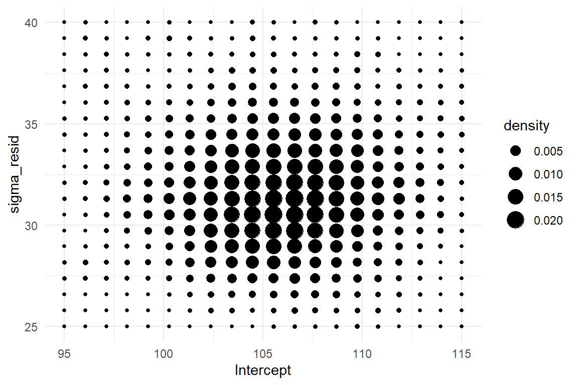
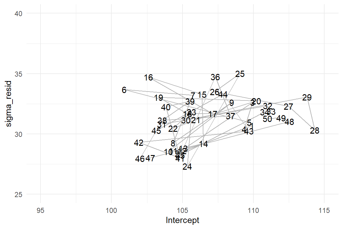
Figure 4.1: Left: The sampled posterior distribution of a GMM. Right: 50 iterations of the MCMC random walk.
Let’s see how this landscape actually emerged from the random walk. In the current case, the parameter space is two-dimensional, as we have \(\mu\) and \(\sigma\). The MCMC procedure starts at a deliberate point in parameter space. At every iteration, the MCMC algorithm attempts a probabilistic jump to another location in parameter space and stores the coordinates. This jump is called probabilistic for two reasons: first, the new coordinates are selected by a random number generator and second, it is either carried out, or not, and that is probabilistic, too. If the new target is in a highly likely region, it is carried out with a higher chance. This sounds circular, but it provenly works. More specifically, the MCMC sampling approach rests on a general proof, that the emerging frequency distribution converges towards the true posterior distribution. This property is called ergodicity and it means we can take the relative frequencies of jumps into a certain area of parameter space as an approximation for our degree of belief that the true parameter value is within this region.
The regression object stores the MCMC results as a long series of positions in parameter space. For any range of interest, it is the relative frequency of visits that represents its certainty. The first 50 jumps of the MCMC random walk are shown in Figure 4.1(right). Apparently, the random walk is not fully random, as the point cloud is more dense in the center area. This is where the more probable parameter values lie. One can clearly see how the MCMC algorithm jumps to more likely areas more frequently. These areas become more dense and, finally, the cloud of visits will approach the contour density plot above.
The more complex regression models grow, the more dimensions the PD gets. The linear regression model in the next chapter has three parameter dimensions, which is difficult to visualize. Multi-level models 6 have hundreds of parameters, which is impossible to intellectually grasp at once. Therefore, it is common to use the marginal posterior distributions (MPD), which give the density of one coefficient at time. My preferred geometry for plotting many MPDs is the violin plot, which packs a bunch of densities and therefore can be used when models of many more dimensions.
P_1 %>%
  ggplot(aes(x = parameter, y = value)) +
  geom_violin() +
  ylim(0, NA)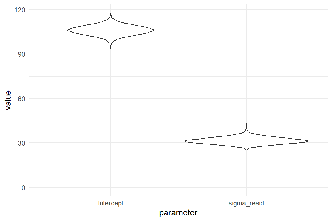
Figure 4.2: Violin plots for (marginal) posterior density
In Figure 4.2 we can spot that the most likely value for average time-on-task is \(106.14\). Both distributions have a certain spread. With a wider PD, far-off values have been visited by the MCMC chain more frequently. The probability mass is more evenly distributed and there is less certainty for the parameter to fall in the central region. In the current case, a risk averse decision maker would maybe take the credibility interval as “reasonably certain.”
Andrew and Jane expect some scepticism from the marketing people, and some lack in statistical skills, too.
What would be the most comprehensible single number to report?
As critical decisions are involved, it seems plausible to report the risk to err: how certain are they that the true value is more than 99 seconds.
We inspect the histograms.
The MPD of the intercept indicates that the average time-on-task is rather unlikely in the range of 99 seconds or better.
But what is the precise probability to err for the 99 seconds statement?
The above summary with coef() does not accurately answer the question.
The CI gives lower and upper limits for a range of 95% certainty in total.
What is needed is the certainty of \(\mu \geq 99\).
Specific questions deserve precise answers.
And once we have understood the MCMC chain as a frequency distribution, the answer is easy: we simply count how many visited values are larger than 99 or 111 (Table 4.4).
P_1 %>%
  filter(parameter == "Intercept") %>%
  summarize(
    p_99 = mean(value >= 99),
    p_111 = mean(value >= 111)
) | p_99 | p_111 |
|---|---|
| 0.985 | 0.059 |
It turns out that the certainty for average time-on-task above the 99 is an overwhelming 0.985. The alternative claim, that average completion time is better than 111 seconds, has a rather moderate risk to err (0.059).
4.1.2 Likelihood and random term
In formal language, regression models are usually specified by likelihood functions and one or more random terms (exactly one in linear models). The likelihood represents the common, predictable pattern in the data. Formally, the likelihood establishes a link between predicted values \(\mu_i\) and predictors. It is common to call predictors with the Greek letter \(\beta\) (beta). If there is more than one predictor, these are marked with subscripts, starting at zero. The “best guess” is called the expected value and is denoted with \(\mu_i\) (“mju i”). If you just know that the average ToT is 106 seconds and you are asked to guess the performance of the next user arriving in the lab, the reasonable guess is just that, 106 seconds.
\[\mu_i = \beta_0\]
Of course, we would never expect this person to use 106 second, exactly. All observed and imagined observations are more or less clumped around the expected value. The random term specifies our assumptions on the pattern of randomness. It is given as distributions (note the plural), denoted by the \(\sim\) (tilde) operator, which reads as: “is distributed.” In the case of linear models, the assumed distribution is always the Normal or Gaussian distribution. Gaussian distributions have a characteristic bell curve and depend on two parameters: the mean \(\mu\) as the central measure and the standard deviation \(\sigma\) giving the spread.
\[y_i \sim \textrm{Gaus}(\mu_i, \sigma_{\epsilon})\]
The random term specifies how all unknown sources of variation take effect on the measures, and these are manifold. Randomness can arise due to all kinds of individual differences, situational conditions, and, last but not least, measurement errors. The Gaussian distribution sometimes is a good approximation for randomness and linear models are routinely used in research. In several classic statistics books, the following formula is used to describe the GMM (and likewise more complex linear models):
\[ \begin{aligned} y_i &= \mu_i + \epsilon_i\\ \mu_i &= \beta_0\\ \epsilon_i &\sim \textrm{Gaus}(0, \sigma_\epsilon) \end{aligned} \]
First, it is to say, that these two formulas are mathematically equivalent. The primary difference to our formula is that the residuals \(\epsilon_i\), are given separately. The pattern of residuals is then specified as a single Gaussian distribution. Residual distributions are a highly useful concept in modelling, as they can be used to check a given model. Then the the classic formula is more intuitive. The reason for separating the model into likelihood and random term is that it works in more cases. When turning to Generalized Linear Models (GLM) in chapter 7, we will use other patterns of randomness, that are no longer additive, like in \(\mu_i + \epsilon_i\). As I consider the use of GLMs an element of professional statistical practice, I use the general formula throughout.
4.1.3 Working with the posterior distribution
Coefficient tables are the standard way to report regression models. They contain all effects (or a selection of interest) in rows. For every parameter, the central tendency (center, magnitude, location) is given, and a statement of uncertainty, by convention 95% credibility intervals (CI).
attach(Sec99)The object M_1 is the model object created by stan_glm.
When you call summary you get complex listings that represent different aspects of the estimated model.
These aspects and more are saved inside the object in a hierarchy of lists.
The central result of the estimation is the posterior distribution (HPD).
With package Rstanarm, the posterior distribution is extracted as follows (Table 4.5):
P_1_wide <-
  as_tibble(M_1) %>%
  rename(Intercept = `(Intercept)`) %>%
  mutate(Iter = row_number()) %>%
  mascutils::go_first(Iter)

P_1_wide %>%
sample_n(8) | Iter | Intercept | sigma |
|---|---|---|
| 3439 | 109.3 | 32.3 |
| 66 | 105.9 | 28.8 |
| 813 | 106.8 | 30.4 |
| 923 | 108.0 | 32.9 |
| 1420 | 107.8 | 31.7 |
| 3076 | 99.2 | 32.7 |
| 1436 | 107.5 | 30.2 |
| 1991 | 104.8 | 31.7 |
The resulting data frame is actually a matrix, where each of the 4000 rows is one coordinate the MCMC walk has visited in a two-dimensional parameter space 4.1.1. For the purpose of reporting parameter estimates, we could create a CLU table as follows (Table 4.6):
P_1_wide %>%
  summarize(
    c_Intercept = median(Intercept),
    l_Intercept = quantile(Intercept, .025),
    u_Intercept = quantile(Intercept, .975),
    c_sigma = median(sigma),
    l_sigma = quantile(sigma, .025),
    u_sigma = quantile(sigma, .975)
) | c_Intercept | l_Intercept | u_Intercept | c_sigma | l_sigma | u_sigma |
|---|---|---|---|---|---|
| 106 | 99.7 | 112 | 31.4 | 27.5 | 36.1 |
As can be seen, creating coefficient tables from wide posterior objects is awful and repetitive, even when there are just two parameters (some models contain hundreds of parameters).
Additional effort would be needed to get a well structured table.
The package Bayr extracts posterior distributions into a long format.
This works approximately like can be seen in the following code, which employs tidyr::pivot_longer to make the wide Rstanarm posterior long (Table 4.7).
P_1_long <-
  P_1_wide %>%
  pivot_longer(!Iter, names_to = "parameter")

P_1_long %>%
sample_n(8) | Iter | parameter | value |
|---|---|---|
| 1136 | Intercept | 103.5 |
| 3726 | sigma | 29.3 |
| 823 | Intercept | 104.2 |
| 2151 | Intercept | 110.2 |
| 1581 | sigma | 28.2 |
| 56 | sigma | 29.8 |
| 1669 | sigma | 32.8 |
| 2401 | Intercept | 103.9 |
With long posterior objects, summarizing over the parameters is more straight-forward and produces a long CLU table, such as 4.8. In other words: Starting from a long posterior makes for a tidy workflow.
P_1_long %>%
  group_by(parameter) %>%
  summarize(
    center = median(value),
    lower = quantile(value, .025),
    upper = quantile(value, .975)
) | parameter | center | lower | upper |
|---|---|---|---|
| Intercept | 106.0 | 99.7 | 112.2 |
| sigma | 31.4 | 27.5 | 36.1 |
With the Bayr package, the posterior command produces such a long posterior object. When called, a Bayr posterior object (class Tbl_post) identifies itself by telling the number of MCMC samples, and the estimates contained in the model, grouped by type of parameter (Table 4.9).
P_1 <- bayr::posterior(M_1)
P_1| model | parameter | type | fixef | count |
|---|---|---|---|---|
| M_1 | Intercept | fixef | Intercept | 1 |
| M_1 | sigma_resid | disp |
The most important benefit of posterior extraction with Bayr is that parameters are classified. Note how the two parameters Intercept and sigma are assigned different parameter types: fixed effect (which is a population-level coefficient) and dispersion. This classification allows us to filter by type of parameter and produce CLU tables, such as Table 4.10.
P_1 %>%
  filter(type == "fixef") %>%
clu()| parameter | fixef | center | lower | upper |
|---|---|---|---|---|
| Intercept | Intercept | 106 | 99.7 | 112 |
Bayr also provides shortcut commands for extracting parameters of a certain type. The above code is very similar to how the bayr::fixef command is implemented.
Note that coef and fixef can be called on the Rstanarm model object, directly, making it unnecessary to first create a posterior table object.
coef(M_1)| parameter | type | fixef | center | lower | upper |
|---|---|---|---|---|---|
| Intercept | fixef | Intercept | 106 | 99.7 | 112 |
4.1.4 Center and interval estimates
The authors of Bayesian books and the various regression engines have different opinions on what to use as center statistic in a coefficient table. The best known option are the mean, the median and the mode. The following code produces these statistics and the results are shown in Table 4.12
attach(Sec99)T_1 <-
P_1 %>%
group_by(parameter) %>%
summarize(
mean = mean(value),
median = median(value),
mode = mascutils::mode(value),
q_025 = quantile(value, .025),
q_975 = quantile(value, .975)
)
kable(T_1, caption = "Various center statistics and 95 percent quantiles")| parameter | mean | median | mode | q_025 | q_975 |
|---|---|---|---|---|---|
| Intercept | 106.0 | 106.0 | 106 | 99.7 | 112.2 |
| sigma_resid | 31.5 | 31.4 | 31 | 27.5 | 36.1 |
We observe that for the Intercept it barely matters which center statistic we use, but there are minor differences for the standard error. We investigate this further by producing a plot with the marginal posterior distributions of \(\mu\) and \(\sigma\) with mean, median and mode (Figure 4.3).
T_1_long <-
  T_1 %>%
  gather(key = center, value = value, -parameter)

P_1 %>%
  ggplot(aes(x = value)) +
  facet_wrap(~parameter, scales = "free_x") +
  geom_density() +
  geom_vline(aes(
    xintercept = value,
    col = center
  ),
  data = T_1_long
  )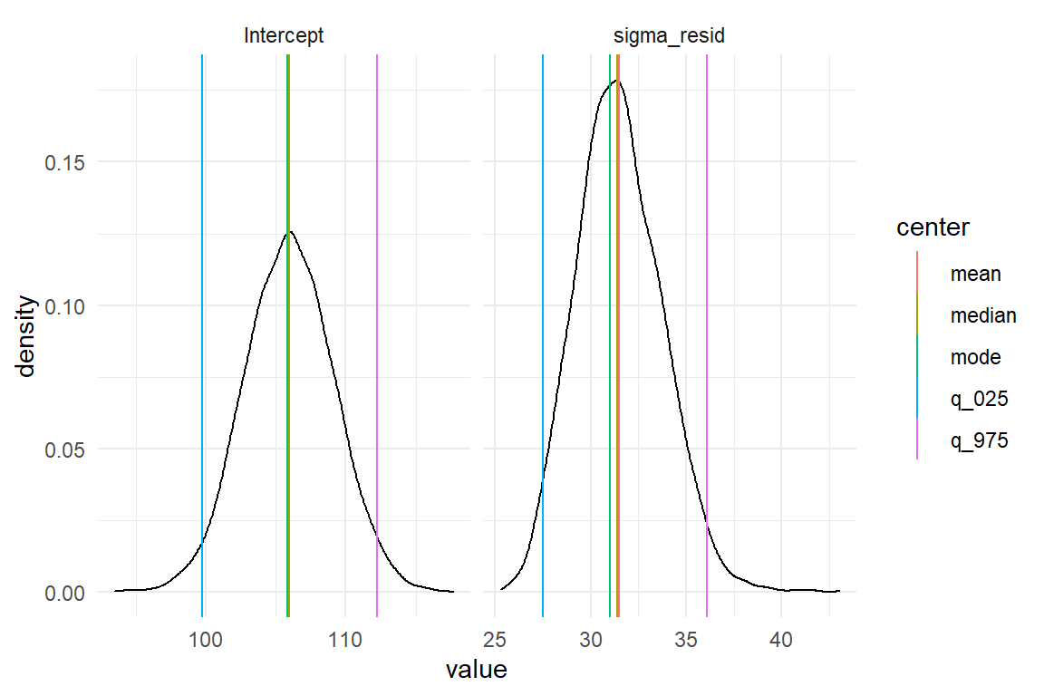
Figure 4.3: Comparing mean, median and mode of marginal posterior distributions
This example demonstrates how the long format posterior works together with the GGplot graphics engine. A density plot very accurately renders how certainty is distributed over the range of a parameter. In order to produce vertical lines for point estimate and limits, we first make the summary table long, with one value per row. This is not how we would usually like to read it, but it is very efficient for adding to the plot.
When inspecting the two distributions, it appears that the distribution of Intercept is completely symmetric. For the standard error, in contrast, we note a slight left skewness. This is rather typical for dispersion parameters, as these have a lower boundary. The closer the distribution sits to the boundary, the steeper becomes the left tail.
A disadvantage of the mean is that it may change under monotonic transformations. A monotonic transformations is a recoding of a variable \(x_1\) into a new variable \(x_2\) by a transformation function \(\phi\) (\(phi\)) such that the order of values stays untouched. Examples of monotonic functions are the logarithm (\(x_2 = \log(x_1)\)), the exponential function (\(x_2 = \exp(x_1)\)), or simply \(x_2 = x_1 + 1\). A counter example is the quadratic function \(x_2 = x_1^2\). In data analysis monotonous transformations are used a lot. Especially Generalized Linear Models make use of monotonous link functions to establish linearity 7.1.1. Furthermore, the mean can also be highly influenced by outliers.
The mode of a distribution is its point of highest density.
It is invariant under monotonic transformations.
It also has a rather intuitive meaning as the most likely value for the true parameter.
Next to that, the mode is compatible with classic maximum likelihood estimation.
When a Bayesian takes a pass on any prior information, the posterior mode should precisely match the results of a classic regression engine (e.g. glm).
The main disadvantage of the mode is that it has to be estimated by one of several heuristic algorithms.
These add some computing time and may fail when the posterior distribution is bi-modal.
However, when that happens, you probably have a more deeply rooted problem, than just deciding on a suitable summary statistic.
The median of a distribution marks the point where half the values are below and the other half are equal or above.
Technically, the median is just the 50% quantile of the distribution.
The median is extremely easy and reliable to compute, and it shares the invariance of monotonous transformations.
This is easy to conceive: The median is computed by ordering all values in a row and then picking the value that is exactly in the middle.
Obviously, this value only changes if the order changes, i.e. a non-monotonous function was applied.
For these advantages, I prefer using the median as center estimates.
Researchers who desire a different center estimate can easily write their own clu.
In this book, 2.5% and 97.5% certainty quantiles are routinely used to form 95% credibility intervals (CI). There is nothing special about these intervals, they are just conventions, Again, another method exists to obtain CIs. Some authors prefer to report the highest posterior density interval (HPD), which is the narrowest interval that contains 95% of the probability mass. While this is intriguing to some extent, HPDs are not invariant to monotonic transformations, either.
So, the parameter extraction commands used here give the median and the 2.5% and 97.5% limits. The three parameters have in common that they are quantiles, which are handled by Rs quantile command.
To demystify the clu, here is how you can make a basic coefficient table yourself Table 4.13:
P_1 %>%
  group_by(parameter) %>%
  summarize(
    center = quantile(value, 0.5),
    lower = quantile(value, 0.025),
    upper = quantile(value, 0.975)
  ) %>%
ungroup() | parameter | center | lower | upper |
|---|---|---|---|
| Intercept | 106.0 | 99.7 | 112.2 |
| sigma_resid | 31.4 | 27.5 | 36.1 |
Note that the posterior contains samples of the dispersion parameter \(\sigma\), too, which means we can get CIs for it. Classic regression engines don’t yield any measures of certainty on dispersion parameters. In classic analyses \(\sigma\) is often denounced as a nuisance parameter and would not be used for inference. I believe that measuring and understanding sources of variation is crucial for design research and several of the examples that follow try to build this case, especially Sections 6.5 and 7.5. Therefore, the capability of reporting uncertainty on all parameters, not just coefficients, is a sur-plus of Bayesian estimation.
4.2 Walk the line: linear regression
In the previous section we have introduced the most basic of all regression models: the grand mean model. It assigns rather coarse predictions, without any real predictors. Routinely, design researchers desire to predict performance based on metric variables, such as:
- previous experience
- age
- font size
- intelligence level and other innate abilities
- level of self efficiacy, neuroticism or other traits
- number of social media contacts
To carry out such a research question, the variable of interest needs to be measured next to the outcome variable. And, the variable must vary. You cannot examine the effects of age or font size on reading performance, when all participants are of same age and you test only one size. Then, for specifying the model, the researcher has to come up with an expectation of how the two are related. Theoretically, that can be any mathematical function, but practically, a linear function is often presumed. Figure 4.4 shows a variety of linear relations between two variables \(x\) and \(y\).
expand_grid(
  intercept = c(0, 1, 2),
  slope = c(-.5, 0, 1.5),
  x = -3:3
) %>%
  arrange(x) %>%
  mutate(
    y = intercept + x * slope,
    slope = as.factor(slope),
    intercept = as.factor(intercept)
  ) %>%
  ggplot(aes(x = x, y = y, color = slope)) +
  geom_line() +
  facet_grid(~intercept)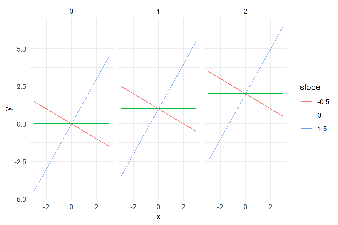
Figure 4.4: Linear terms differing by intercepts and slopes
A linear function is a straight line, which is specified by two parameters: intercept \(\beta_0\) and slope \(\beta_1\):
\[ f(x_1) = \beta_0 + \beta_1x_{1i} \]
The intercept is “the point where a function graph crosses the x-axis”, or more formally:
\[ f(x_1 = 0) = \beta_0 \]
The second parameter, \(\beta_1\) is called the slope. The slope determines the steepness of the line. When the slope is \(.5\), the line will rise up by .5 on Y, when moving one step to the right on X.
\[ f(x_1 + 1) = \beta_0 + \beta_1x_{1i} + \beta_1 \]
There is also the possibility that the slope is zero. In such a case, the predictor has no effect and can be left out. Setting \(\beta_1 = 0\) produces a horizontal line, with \(y_i\) being constant over the whole range. This shows that the GMM is a special case of LRMs, where the slope is fixed to zero, hence \(\mu_i = \beta_0\).
Linear regression gives us the opportunity to discover how ToT can be predicted by age (\(x_1\)) in the BrowsingAB case. In this hypothetical experiment, two designs A and B are compared, but we ignore this for now. Instead we ask: are older people slower when using the internet? Or: is there a linear relationship between age and ToT? The structural term is:
\[ \mu_i = \beta_0 + \beta_1\textrm{age}_{i} \]
This literally means: with every year of age, ToT increases by \(\beta_1\) seconds.
Before we run a linear regression with stan_glm, we visually explore the association between age and ToT using a scatter plot.
The blue line in the graph is a so called a smoother, more specifically a LOESS.
A smoother is an estimated line, just as linear function.
But, it is way more flexible.
Where the linear function is a straight stick fixed at a pivotal point, LOESS is more like a pipe cleaner.
here, LOESS shows a more detailed picture of the relation between age and ToT.
There is a rise between 20 and 40, followed by a stable plateau, and another rise starting at 60.
Actually, that does not look like a straight line, but at least there is steady upwards trend (Figure 4.5).
attach(BrowsingAB)BAB1 %>%
ggplot(aes(x = age, y = ToT)) +
geom_point() +
geom_smooth(se = F, fullrange = F)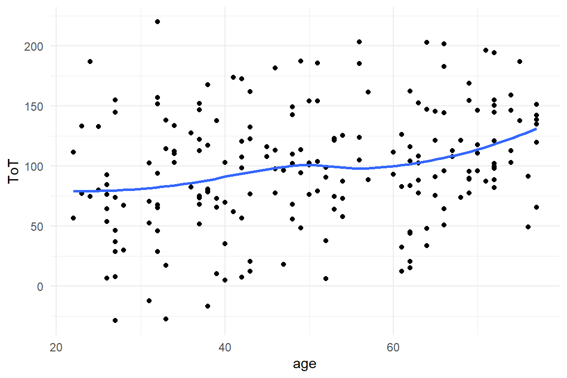
Figure 4.5: Using a scatterplot and smoother to check for linear trends
In fact, the BrowsingAB simulation contains what one could call a psychological model.
The effect of age is partly due to farsightedness of participants (making them slower at reading), which more or less suddenly kicks in at a certain range of age.
Still, we make do with a rough linear approximation.
To estimate the model, we use the stan_glm command in much the same way as before, but add the predictor age.
The command will internally check the data type of your variable, which is metric in this case.
Therefore, it is treated as a metric predictor (sometimes also called covariate) .
M_age <-
  BAB1 %>%
  stan_glm(ToT ~ 1 + age,
    data = .
)coef(T_age)| parameter | fixef | center | lower | upper |
|---|---|---|---|---|
| Intercept | Intercept | 57.17 | 34.053 | 79.53 |
| age | age | 0.82 | 0.401 | 1.24 |
Is age associated with ToT? Table 4.14 tells us that with every year of age, users get \(0.82\) seconds slower, which is considerable. It also tells us that the predicted performance at age = 0 is \(57.17\).
4.2.1 Transforming measures
In the above model, the intercept represents the predicted ToT at age == 0, of a newborn.
We would never seriously put that forward in a stakeholder presentation, trying to prove that babies benefit from the redesign of a public website, would we?
The prediction is bizarre because we intuitively understand that there is a discontinuity up the road, which is the moment where a teenager starts using public websites.
We also realize that over the whole life span of a typical web user, say 12 years to 90 years, age actually is a proxy variable for two distinct processes: the rapid build-up of intellectual skills from childhood to young adulthood and the slow decline of cognitive performance, which starts approximately, when the first of us get age-related far-sightedness.
Generally, with linear models, one should avoid making statements about a range that has not been observed.
Linearity, as we will see in 7.1.1, always is just an approximation for a process that truly is non-linear.
Placing the intercept where there is no data has another consequence: the estimate is rather uncertain, with a wide 95% CI, \(57.17 [34.05, 79.54]_{CI95}\). As a metaphor, think of the data as a hand that holds the a stick, the regression line and tries to push a light switch. The longer the stick, the more difficult is becomes to hit the target.
4.2.1.1 Shifting an centering
Shifting the predictor is a pragmatic solution to the problem: “Shifting” means that the age predictor is moved to the right or the left, such that point zero is in a region populated with observations. In this case, two options seem to make sense: either, the intercept is in the region of youngest participants, or it is the sample average, which is then called centering. To shift a variable, just subtract the amount of units (years) where you want the intercept to be. The following code produces a shift of -20 and a centering on the original variable age:
BAB1 <-
  BAB1 %>%
  mutate(
    age_shft = age - 20,
    age_cntr = age - mean(age)
  )

BAB1 %>%
  tidyr::gather("predictor", "age", starts_with("age")) %>%
  ggplot(aes(x = age, y = ToT)) +
  facet_grid(predictor ~ .) +
  geom_point() +
  geom_smooth(se = F, method = "lm", fullrange = T)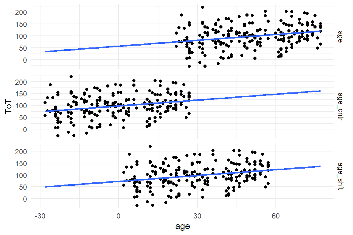
Figure 4.6: Shifting and centering of variable Age
By shifting the age variable, the whole data cloud is moved to the left (Figure 4.6). To see what happens on the inferential level, we repeat the LRM estimation with the two shifted variables:
M_age_shft <-
  stan_glm(ToT ~ 1 + age_shft, data = BAB1)

M_age_cntr <-
  stan_glm(ToT ~ 1 + age_cntr, data = BAB1)
We combine the posterior distributions into one multi-model posterior and read the multi-model coefficient table:
P_age <-
  bind_rows(
    posterior(M_age),
    posterior(M_age_shft),
    posterior(M_age_cntr)
  )

coef(P_age)| model | parameter | fixef | center | lower | upper |
|---|---|---|---|---|---|
| M_age | Intercept | Intercept | 57.17 | 34.053 | 79.53 |
| M_age | age | age | 0.82 | 0.401 | 1.24 |
| M_age_cntr | Intercept | Intercept | 98.04 | 91.521 | 104.21 |
| M_age_cntr | age_cntr | age_cntr | 0.82 | 0.395 | 1.24 |
| M_age_shft | Intercept | Intercept | 73.20 | 59.117 | 87.75 |
| M_age_shft | age_shft | age_shft | 0.82 | 0.395 | 1.23 |
## [1] "BAB1"When comparing the regression results the shifted intercepts have moved to higher values, as expected. Surprisingly, the simple shift is not exactly 20 years. This is due to the high uncertainty of the first model, as well as the relation not being exactly linear (see Figure XY). The shifted age predictor has a slightly better uncertainty, but not by much. This is, because the region around the lowest age is only scarcely populated with data. Centering, on the other hand, results in a highly certain estimate, due to the dence data. The slope parameter, however, practically does not change, neither in magnitude nor in certainty.
Shift (and centering) move the scale of measurement and make sure that the intercept falls close (or within) the cluster of observations. Shifting does not change the unit size, which is still in years. For truly metric predictors, changing the unit is not desirable, as the unit of measurement is natural and intuitive.
4.2.1.2 Rescaling
Most rating scales are not natural units of measure. Most of the time it is not meaningful to say: “the user experience rating improved by one.” The problem has two roots, as I will illustrate by the following four rating scale items:
This product is …
easy to use |1 ... X ... 3 ... 4 ... 5 ... 6 ... 7| difficult to useheavenly |-----X-------------------------------| hellishneutral |1 ... 2 ... 3 ... 4| uncanny
If you would employ these three scales to assess one and the same product. Using a simulator for rating scale data from package Mascutils (Table 4.16), the data acquired these three rating scales could look like (Figure 4.7)
library(mascutils)

set.seed(42)
Raw_ratings <-
  tibble(
    Part = 1:100,
    easy_difficult = rrating_scale(100, 0, .5,
      ends = c(1, 7)
    ),
    heavenly_hellish = rrating_scale(100, 0, .2,
      ends = c(0, 10),
      bin = F
    ),
    neutral_uncanny = rrating_scale(100, -.5, .5,
      ends = c(1, 5)
    )
  ) %>%
  as_tbl_obs()

Raw_ratings| Obs | Part | easy_difficult | heavenly_hellish | neutral_uncanny |
|---|---|---|---|---|
| 8 | 8 | 4 | 4.94 | 2 |
| 24 | 24 | 5 | 4.50 | 2 |
| 25 | 25 | 6 | 5.00 | 3 |
| 70 | 70 | 5 | 5.45 | 2 |
| 74 | 74 | 3 | 5.84 | 3 |
| 80 | 80 | 3 | 5.00 | 3 |
| 84 | 84 | 4 | 5.15 | 3 |
| 91 | 91 | 5 | 5.10 | 2 |
In the following, we are comparing the results of these three items. However, data came in the wide format, as you would use to create a correlation table. For a tidy analysis, we first make the data set long. Ratings are now classified by the item they came from (Table 4.17). From this we can produce a grid histogram (Figure 4.7).
D_ratings <-
  Raw_ratings %>%
  select(-Obs) %>%
  pivot_longer(!Part, 1:3, names_to = "Item", values_to = "rating") %>%
  as_tbl_obs()

D_ratings| Obs | Part | Item | rating |
|---|---|---|---|
| 3 | 1 | neutral_uncanny | 1.00 |
| 10 | 4 | easy_difficult | 5.00 |
| 16 | 6 | easy_difficult | 4.00 |
| 149 | 50 | heavenly_hellish | 4.47 |
| 195 | 65 | neutral_uncanny | 2.00 |
| 224 | 75 | heavenly_hellish | 5.43 |
| 231 | 77 | neutral_uncanny | 3.00 |
| 243 | 81 | neutral_uncanny | 3.00 |
D_ratings %>%
  ggplot(aes(x = rating)) +
  facet_grid(Item ~ .) +
  geom_histogram() +
  xlim(0, 10)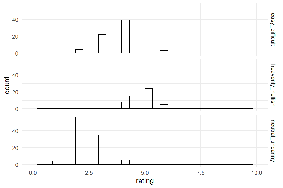
Figure 4.7: Distribution of three rating scale items
The first problem is that rating scales have been designed with different end points.
The first step when using different rating scales is shifting the left-end point to zero and dividing by the range of the measure (upper - lower boundary).
That brings all items down to the range between zero and one.
Note how the following tidy code joins D_ratings with a table D_Items. That adds the lower and upper boundaries for every observation, from which we can standardize the range (Figure 4.8).
D_Items <- tribble(
  ~Item, ~lower, ~upper,
  "easy_difficult", 1, 7,
  "heavenly_hellish", 0, 10,
  "neutral_uncanny", 1, 5
)


D_standard <-
  D_ratings %>%
  left_join(D_Items, by = "Item") %>%
  mutate(scaled = (rating - lower) / (upper - lower))

D_standard %>%
  ggplot(aes(x = scaled)) +
  facet_grid(Item ~ .) +
  geom_histogram(bins = 20) +
  xlim(0, 1)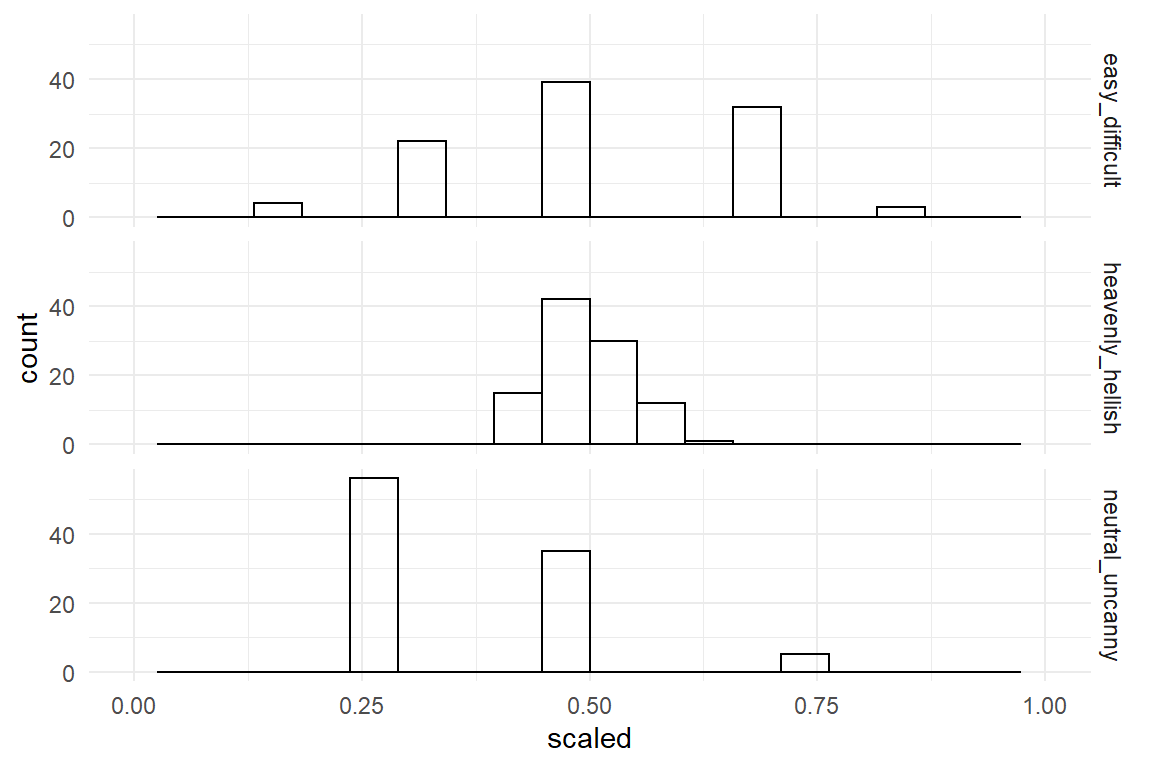
Figure 4.8: Distribution of three rating scale items with standardized boundaries
This partly corrects the horizontal shift between scales. However, the ratings on the third item still are shifted relative to the other two. The reason is that the first two items have the neutral zone right in the center, whereas the third item is neutral at its left-end point. That is called bipolar and monopolar items. The second inconsistency is that the second item uses rather extreme anchors (end point labels, which produces a tight accumulation in the center of the range. You could say that, on a cosmic scale people agree. The three scales have been rescaled by their nominal range, but they differ in their observed variance.
By z-transformation a measure is shifted, not by its nominal boundaries, but observed standard deviation. A set of measures is z-transformed by centering it and scaling it by its own standard deviation.
D_ratings %>%
  group_by(Item) %>%
  mutate(zrating = (rating - mean(rating)) / sd(rating)) %>%
  ungroup() %>%
  ggplot(aes(x = zrating)) +
  facet_grid(Item ~ .) +
  geom_histogram(bins = 10)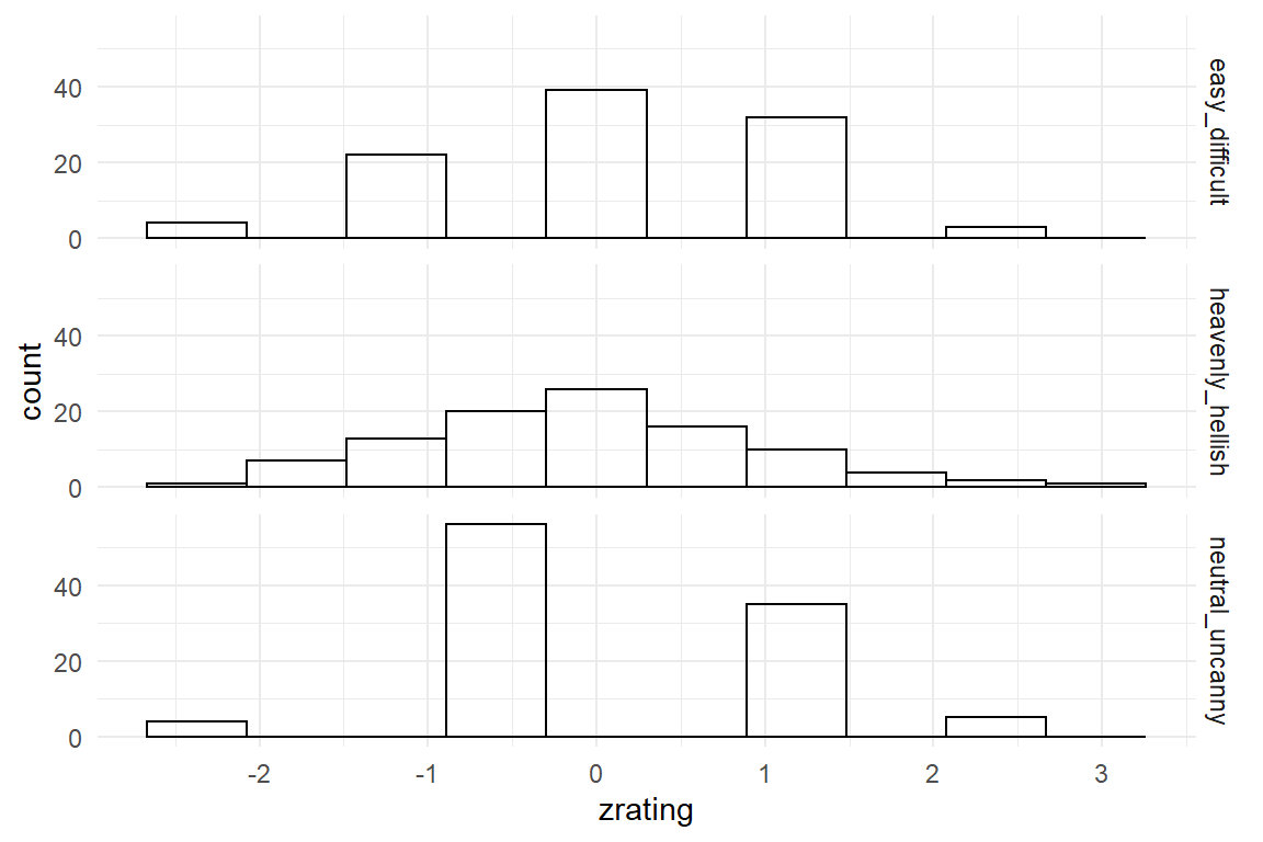
Figure 4.9: Z-transformation removes differences in location and dispersion
By z-transformation, the three scales now exhibit the same mean location and the same dispersion Table 4.9. This could be used to combine them into one general score. Note however, that information is lost by this process, namely the differences in location or dispersion. If the research question is highly detailed, such as “Is the design consistently rated low on uncanniness?” this can no longer be answered from the z-transformed variable.
Finally, sometimes researchers use logarithmic transformation of outcome measures to reduce what they perceive as pathologies of tha data. In particular, many outcome variables do not follow a Normal distribution, as the random term of linear models assumes, but are left-skewed. Log-transformation often mitigates such problems. However, as we will see in chapter 7, linear models can be estimated gracefully with a random component that precisely matches the data as it comes. The following time-on-task data is from the IPump study, where nurses have tested two infusion pump interfaces. The original ToT data is strongly left-skewed, which can be mitigated by log-transformation (Figure 4.10).
attach(IPump)D_pumps %>%
mutate(log_ToT = log(ToT)) %>%
select(Design, ToT, log_ToT) %>%
gather(key = Measure, value = value, -Design) %>%
ggplot(aes(x = value, color = Design)) +
facet_wrap(Measure ~ ., scale = "free") +
geom_density()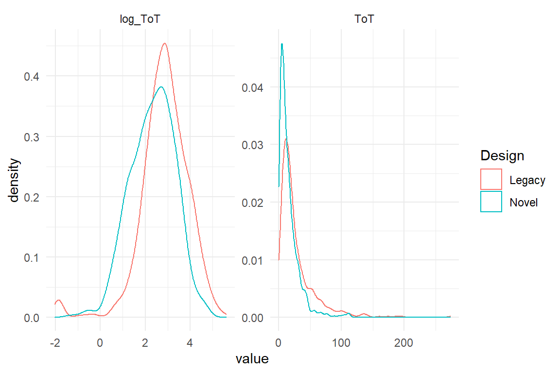
Figure 4.10: Log transformation cam be used to bend highly left skewed distributions into a more symmetric shape
Frequently, it is count measures and temporal measures to exhibit non-symmetric error distributions. By log transformation one often arrives at a reasonably Gaussian distributed error. However, the natural unit of te measure (seconds) gets lost by the transformation, making it very difficult to report the results in a quantitative manner.
4.2.2 Correlations
LRM render the quantitative relationship between two metric variables. Another commonly known statistic that seems to do something similar is Pearson’s correlation statistic \(r\) (3.3.4). In the following, we will see that a tight connection between correlation and linear coefficients exists, albeit both having their own advantages. For a demonstration, we reproduce the steps on a simulated data set where X and Y are linearly linked (Figure @ref(fig:corr_1))
set.seed(42)
D_cor <-
  tibble(
    x = runif(50, 0, 50),
    y = rnorm(50, x * .2, 3)
  )
D_cor %>%
ggplot(aes(x = x, y = y)) +
geom_point() +
geom_smooth(method = "lm", se = F)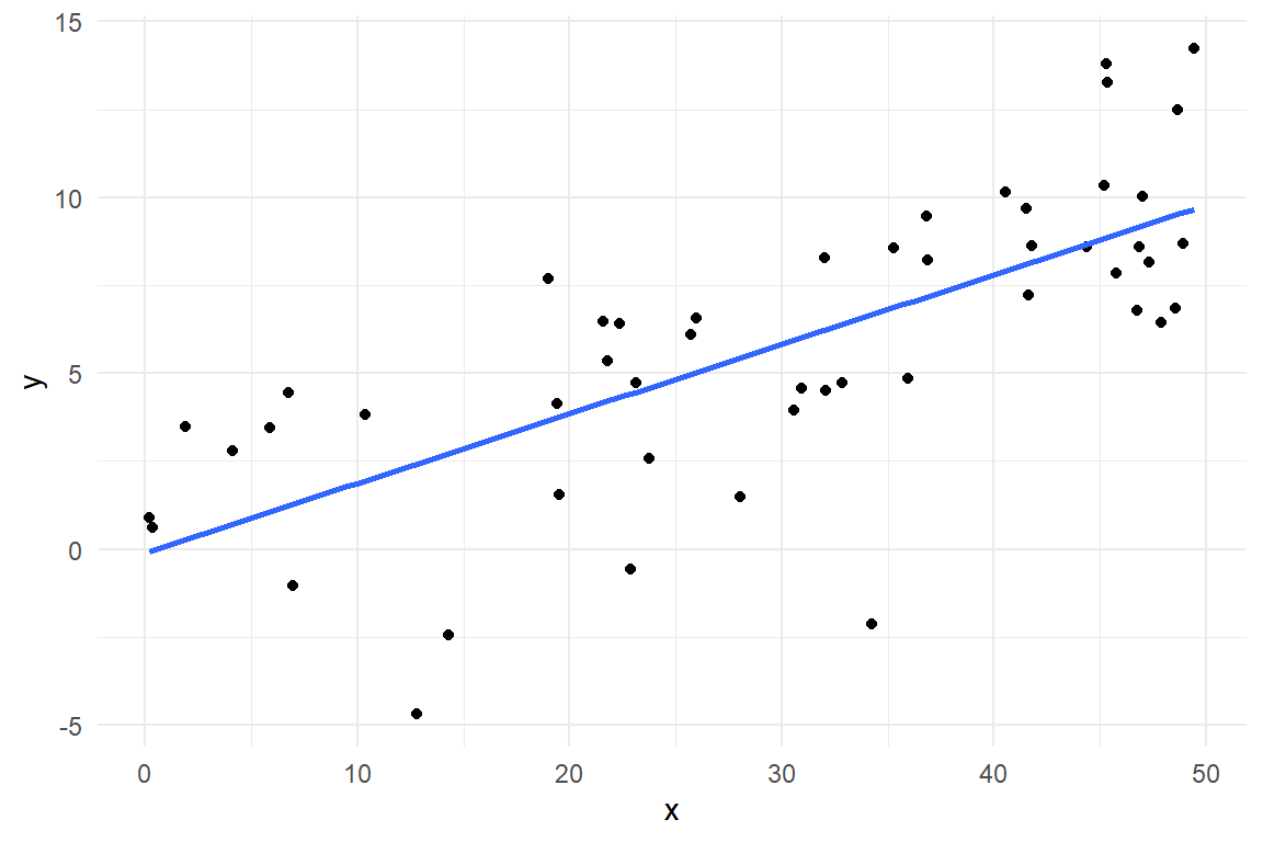
Figure 4.11: A linear association between X and Y
Recall, that \(r\) is covariance standardized for dispersion, not unsimilar to z-transformation 4.2.1 and that a covariance is the mean squared deviance from the population mean. This is how the correlation is decontaminated from the idiosyncracies of the involved measures, their location and dispersion. Similarly, the slope parameter in a LRM is a measure of association, too. It is agnostic of the overall location of measures since this is captured by the intercept. However, dispersion remains intact. This ensures that the slope and the intercept together retain information about location, dispersion and association of data, and we can ultimately make predictions. Still, there is a tight relationship between Pearson’s \(r\) and a slope coefficient \(\beta_1\), namely:
\[ r = \beta_1 \frac{\sigma_X}{\sigma_Y} \]
For the sole purpose of demonstration, we here resort to the built-in non-Bayesian command lm for doing the regression.
M_cor <- stan_glm(y ~ x, data = D_cor)beta_1 <- coef(M_cor)$center[2]
r <- beta_1 * sd(D_cor$x) / sd(D_cor$y)
cat("the correlation is: ", r)## the correlation is: 0.715The clue with Pearson’s \(r\) is that it normalized the slope coefficient by the variation found in the sample. This resembles z-transformation as was introduced in 4.2.1. In fact, when both, predictor and outcome, are z-transformed before estimation, the coefficient equals Pearson’s \(r\) almost precisely. The minor deviation stems from the relatively short MCMC chains.
M_z <-
  D_cor %>%
  mutate(
    x_z = (x - mean(x)) / sd(x),
    y_z = (y - mean(y)) / sd(y)
  ) %>%
  stan_glm(y_z ~ x_z,
    data = .
  )
beta_1 <- coef(M_z)$center[2]
cat("On z standardized outcomes the coefficient is", beta_1)## On z standardized outcomes the coefficient is 0.717Pearson’s \(r\) spawns from a different school of thinking than Bayesian parameter estimation: analysis of variance (ANOVA). Roughly, this family of methods draws on the idea of dividing the total variance of the outcome variable into two components: explained variance and residual variance. The very formula of the variance parameter reveals its connection to covariance (it is even allowed to say, that variance is the covariance of a variable with itself):
\[ \textrm{Var}_{X} = \frac{1}{n} \sum_{i=1}^n (x_i - E(X))^2 \]
In ANOVA models, when explained variance is large, as compared to residual variance, the F-statistic goes up and stars twinkle behind the p-value. While I am far from promoting any legacy approaches, here, a scale-less measure of association strength bears some intuition in situations, where at least one of the involved variables has no well-defined scale. That is in particular the case with rating scales. Measurement theory tells that we may actually transform rating scales fully to our liking, if just the order is preserved (ordinal scales). That is a pretty weak criterion and, strictly speaking, forbids the application of linear models (and ANOVA) altogether, where at least sums must be well defined (interval scales).
Not by coincidence, a measure of explained variance, the coefficient of determination r^2 can be derived as from Pearson’s \(r\), by simply squaring it. \(r^2\) is in the range \([0;1]\) and represents the proportion of variability that is explained by the predictor:
To sum it up, Pearson \(r\) and \(r^2\) are useful statistics to express the strength of an association, when the scale of measurement does not matter or when one desires to compare across scales. Furthermore, correlations can be part of advanced multilevel models which we will treat in
In regression modelling the use of coefficients allows for predictions made in the original units of measurement. Correlations, in contrast, are unit-less. Still, correlation coefficients play an important role in exploratory data analysis (but also in multilevel models, see 6.8.2 for the following reasons:
- Correlations between predictors and responses are a quick and dirty assessment of the expected associations.
- Correlations between multiple response modalities (e.g., ToT and number of errors) indicate to what extent these responses can be considered exchangeable.
- Correlations between predictors should be checked upfront to avoid problems arising from so-called collinearity.
The following table shows the correlations between measures in the MMN study, where we tested the association between verbal and spatial working memory capacity (Ospan and Corsi tests and performance in a search task on a website (clicks and time).
These correlations give an approximate picture of associations in the data:
- Working memory capacity is barely related to performance.
- There is a strong correlations between the performance measures.
- There is a strong correlation between the two predictors Ospan.A and Ospan.B.
Linear coefficients and correlations both represent associations between measures. Coefficients preserve units of measuremnent, allowing us to make meaningful quantitative statements. Correlations are re-scaled by the observed dispersion of measures in the sample, making them unit-less. The advantage is that larger sets of associations can be screened at once and compared easily.
4.2.3 Endlessly linear
On a deeper level the bizarre age = 0 prediction is an example of a principle , that will re-occur several times throughout this book.
In our endless universe everything is finite.
A well understood fact about LRM is that they allow us to fit a straight line to data. A lesser regarded consequence from the mathematical underpinnings of such models is that this line extends infinitely in both directions. To fulfill this assumption, the outcome variable needs to have an infinite range, too, \(y_i \in [-\infty; \infty]\) (unless the slope is zero). Every scientifically trained person and many lay people know, that even elementary magnitudes in physics are finite: all speeds are limited to \(\approx 300.000 km/s\), the speed of light, and temperature has a lower limit of \(-276°C\) (or \(0°K\)). If there can neither be endless acceleration nor cold, it would be daring to assume any psychological effect to be infinite in both directions.
The endlessly linear assumption (ELA) is a central piece of all LRMs, that is always violated in a universe like ours. So, should we never ever use a linear model and move on to non-linear models right away? Pragmatically, the LRM often is a reasonably effective approximation. At the beginning of section 4.2, we have seen that the increase of time-on-task by age is not strictly linear, but follows a more complex curved pattern. This pattern might be of interest to someone studying the psychological causes of the decline in performance. For the applied design researcher it probably suffices to see that the increase is monotonous and model it approximately by one slope coefficient. In 5.1 we will estimate the age effects for designs A and B separately, which lets us compare fairness towards older people.
As has been said, theorists may desire a more detailed picture and see a disruption of linearity as indicators for interesting psychological processes. A literally uncanny example of such theoretical work will be given when introducing polynomial regression 5.5. For now, linear regression is a pragmatic choice, as long as:
- the pattern is monotonically increasing
- any predictions stay in the observed range and avoid the boundary regions, or beyond.
4.3 Factorial Models
In the previous section we have seen how linear models are fitting the association between a metric predictor X and an outcome variable Y to a straight line with a slope and a point of intercept. Such a model creates a prediction of Y, given you know the value of measure X.
However, in many research situations, the predictor variable carries not a measure, but a group label. Factor variables assign observations to one of a set of predefined groups, such as the following variables do in the BrowsingAB case (Table 4.18):
attach(BrowsingAB)

BAB5 %>%
select(Obs, Part, Task, Design, Gender, Education, Far_sighted)| Obs | Part | Task | Design | Gender | Education | Far_sighted |
|---|---|---|---|---|---|---|
| 191 | 11 | 2 | B | F | Middle | FALSE |
| 251 | 11 | 4 | B | F | Middle | FALSE |
| 42 | 12 | 2 | A | M | Middle | FALSE |
| 32 | 2 | 2 | A | F | High | TRUE |
| 25 | 25 | 1 | A | F | Middle | FALSE |
| 238 | 28 | 3 | B | F | Low | TRUE |
| 157 | 7 | 1 | B | M | High | FALSE |
| 248 | 8 | 4 | B | M | High | FALSE |
Two of the variables, Gender and Education clearly carry a group membership of the participants. That is a natural way to think of people groups, such as male of female, or which school type they went to. But, models are inert to anthropocentrism and can divide everything into groups. Most generally, it is always the observations, i.e. the rows in a (tidy) data table, which are divided into groups. Half of the observations habe been made with design A, the rest with B.
The data also identifies the participant and the task for every observation. Although do we see numbers on participants, these are factors, not metric variables. If one had used initials of participants, that would not make the slightest difference of what this variable tells. It also does not matter, whether the researcher has actually created the levels, for example by assigning participants to one of two deisgn conditions, or has just observed it, such as demographic variables.
Factorial models are frequently used in experiments, where the effect a certain condition on performance is measured. In design research, that is the case when comparing two (or more) designs and the basic model for that, the comparison of group means model, will be introduced, first 4.3.1, with more details on the inner workings and variations in the two sections that follow: dummy variables 4.3.2 and 4.3.3. A CGM requires that one can think of one of the groups as some kind of default to which all the other conditions are compared to. That is not always given. When groups are truly equal among sisters, the absolute means model (AMM) 4.3.4 does just estimates the absolute group mans, being like multi-facetted GMMs.
Factors are not metric, but sometimes they have a natural ordered, for example levels of education, or position in a sequence. In section 4.3.5 we will apply an ordered factorial model to a learning sequence.
4.3.1 A versus B: Comparison of groups
The most common linear models on factors is the comparison of groups (CGM), which replaces the commonly known analysis of variance (ANOVA). In design research group comparisons are all over the place, for example:
- comparing designs: as we have seen in the A/B testing scenario
- comparing groups of people, based on e.g. gender or whether they have a high school degree
- comparing situations, like whether an app was used on the go or standing still
In order to perform a CGM, a variable is needed that establishes the groups. This is commonly called a factor. A factor is a variable that identifies members of groups, like “A” and “B” or “male” and “female.” The groups are called factor levels. In the BrowsingAB case, the most interesting factor is Design with its levels A and B.
Asking for differences between two (or more) designs is routine in design research. For example, it could occur during an overhaul of a municipal website. With the emerge of e-government, many municipal websites have grown wildly over a decade. What once was a lean (but not pretty) 1990 website has grown into a jungle over time, to the disadvantage for users. The BrowsingAB case could represent the prototype of a novel web design, which is developed and tested via A/B testing at 200 users. Every user is given the same task, but sees only one of the two designs. The design team is interested in: Do the two web designs A and B differ in user performance? Again, we first take a look at the raw data (Figure 4.12)),
attach(BrowsingAB)BAB1 %>%
ggplot(aes(x = ToT)) +
geom_histogram() +
facet_grid(Design ~ .)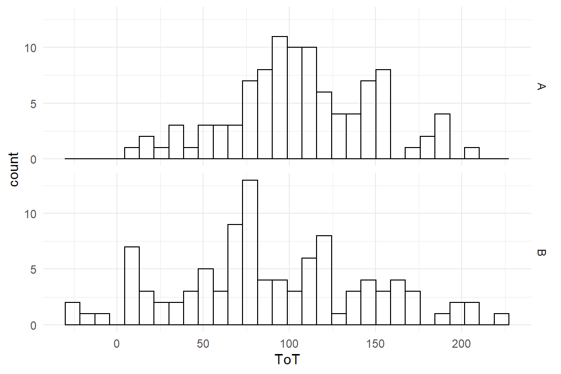
Figure 4.12: Histogram showing ToT distributions in two groups
The difference, if it exists, is not striking. We might consider a slight advantage for design B, but the overlap is immense. We perform the CGM. Again, this is a two-step procedure:
- The
stan_glmcommand lets you specify a simple formula to express the dependency between one or more predictors (education) and an outcome variable (ToT). It performs the parameter estimation using the method of Markov-Chain Monte-Carlo Sampling. The results are stored in a new objectM_CGM. - With the
coefcommand the estimates are extracted and can be interpreted (Table 4.19).
M_CGM <-
  BAB1 %>%
  stan_glm(ToT ~ 1 + Design,
    data = .
)coef(M_CGM)| parameter | fixef | center | lower | upper |
|---|---|---|---|---|
| Intercept | Intercept | 106.6 | 97.2 | 116.4 |
| DesignB | DesignB | -17.5 | -30.6 | -4.2 |
The model contains two parameters, one Intercept and one slope. Wait a second? How can you have a slope and a “crossing point zero,” when there is no line, but just two groups? This will be explained further in 4.3.2 and 4.3.3. Fact is, in the model at hand, the Intercept is the mean of a reference group. Per default, stan_glm chooses the alphabetically first group label as the reference group, in this case design A. We can therefore say that design A has an average performance of \(106.65 [97.2, 116.41]_{CI95}\).
The second parameter is the effect of “moving to design B.” It is given as the difference to the reference group. With design B it took users \(17.49 [30.62, 4.2]_{CI95}\) seconds less to complete the task. However, this effect appears rather small and there is huge uncertainty about it. It barely justifies the effort to replace design A with B. If the BrowsingAB data set has some exciting stories to tell, the design difference is not it.
A frequent user problem with CGMs is that the regression engine selects the alphabetically first level as the reference level, which often is not correct.
Supposed, the two designs had been called Old (A) and New (B), then regression engine would pick New as the reference group.
Or think of non-discriminating language in statistical reports.
In BrowsingAB, gender is coded as f/m and female participants conquer the Intercept.
But, sometimes my students code gender as v/m or w/m.
Oh, my dear!
The best solution is, indeed, to think upfront and try to find level names that make sense.
If that is not possible, then the factor variable, which is often of type character must be made a factor, which is a data type in its own right in R.
When the regression engine sees a factor variable, it takes the first factor level as reference group.
That would be nice, but when a factor is created using the as.factor, it again takes an alphabethical order of levels.
This is over-run by giving a vector of levels in the desired order.
The tidy Foracts package provides further commands to set the order of a factor levels.
Gender <- sample(c("v", "m"), 4, replace = T)

factor(Gender)
## [1] m v m m
## Levels: m vfactor(Gender, c("v", "m"))## [1] m v m m
## Levels: v m4.3.2 Not stupid: dummy variables
Are we missing anything so far? Indeed, I avoided to show any mathematics on factorial models. The CGM really is a linear model, although it may not appear so, at first. So, how can a variable enter a linear model equation, that is not a number? Linear model terms are a sum of products \(\beta_ix_i\), but factors cannot just enter such a term. What would be the result of \(\mathrm{DesignB} \times\beta_1\)?
Factors basically answer the question: What group does the observation belong to?. This is a label, not a number, and cannot enter the regression formula. Dummy variables solve the dilemma by converting factor levels to numbers. This is done by giving every level \(l\) of factor \(K\) its own dummy variable K_l. Now every dummy represents the simple question: Does this observation belong to group DesignB?. The answer is coded as \(0\) for “Yes” and \(1\) for “No.”
attach(BrowsingAB)BAB1_dum <-
BAB1 %>%
mutate(
Design_A = if_else(Design == "A", 1, 0),
Design_B = if_else(Design == "B", 1, 0)
) %>%
select(Obs, Design, Design_A, Design_B, ToT)
BAB1_dum| Obs | Design | Design_A | Design_B | ToT |
|---|---|---|---|---|
| 31 | A | 1 | 0 | 182.7 |
| 43 | A | 1 | 0 | 186.9 |
| 113 | B | 0 | 1 | 57.7 |
| 162 | B | 0 | 1 | 28.5 |
| 165 | B | 0 | 1 | 56.4 |
| 175 | B | 0 | 1 | 64.4 |
| 190 | B | 0 | 1 | 111.3 |
| 196 | B | 0 | 1 | 121.2 |
The new dummy variables are numerical and can very well enter a linear formula, every one getting its own coefficient. For a factor K with levels A, B and C the linear formula can include the dummy variables \(K_{Ai}\) and \(K_{Bi}\):
\[ \mu_i = K_{Ai} \beta_{A} + K_{Bi} \beta_{B} \]
The zero/one coding acts like a switches. When \(K_{Ai}=1\), the parameter \(\beta_A\) is switched on and enters the sum, and \(\beta_B\) is switched off. An observation of group A gets the predicted value: \(\mu_i = \beta_A\), vice versa for members of group B.
M_dummy_1 <-
  stan_glm(ToT ~ 0 + Design_A + Design_B,
    data = BAB1_dum
)coef(M_dummy_1)| parameter | fixef | center | lower | upper |
|---|---|---|---|---|
| Design_A | Design_A | 106.6 | 96.8 | 116.0 |
| Design_B | Design_B | 89.4 | 79.9 | 98.9 |
In its predictions, the model M_dummy is equivalent to the CGM model M_CGM, but the coefficients mean something different. In the CGM, we got an intercept and a group difference, here we get both group means (Table 4.21).
This model we call an absolute means model (AMM) and will discuss it in section 4.3.4.
First, we have to come back to the question, how the regression engine produces its dummy variables, such that the coefficients are differences towards one Intercept.
When encountering a factorial predictor, our regression engine uses not group means, but what is called treatment contrast coding (4.3.3).
4.3.3 Treatment contrast coding
The default behaviour of regression engines, when encountering a factor, is to select the first level as reference group and estimate all other levels relative to that. Coefficients express differences. This fully makes sense if the effect of a treatment is what you are after, and is therefore called treatment contrasts. Treatment contrasts do not have anything special or natural to them, but is a very particular way of thinking about levels of a factor, namely that one level is special. In controlled experiments, this special level often is the control condition, whereas the coefficients are the effects of well-defined manipulations. This most prominently is the case for clinical trials, where the placebo group is untreated. This works well in all situations where a default situation exists and the other factor levels can be thought of manipulations of the default:
- A redesign as an improvement over the current design.
- A quiet, comfortable environment is the optimal situation for cognitive performance.
- There is a minimum level of education requird for most jobs
We have seen how to create dummy variables ourselves by means of mututally exclusive on-off switches, which results in absolute means coefficients. Regression engines quietly assume that treatment effects is what the user wants and expand dummy variables in a different way: For a factor with levels A and B, the dummy for B is an on-off switch, whereas the reference level A is set always on. This way of creating dummy variables is called treatment contrast coding:
BAB1_treat <-
  BAB1_dum %>%
  mutate(
    Intercept = 1,
    Design_B = if_else(Design == "B", 1, 0)
  ) %>%
  select(Obs, Design, Intercept, Design_B, ToT)
BAB1_treat| Obs | Design | Intercept | Design_B | ToT |
|---|---|---|---|---|
| 6 | A | 1 | 0 | 20.4 |
| 15 | A | 1 | 0 | 185.7 |
| 34 | A | 1 | 0 | 168.8 |
| 38 | A | 1 | 0 | 107.6 |
| 84 | A | 1 | 0 | 147.2 |
| 94 | A | 1 | 0 | 120.4 |
| 95 | A | 1 | 0 | 117.1 |
| 199 | B | 1 | 1 | 112.9 |
A frequent user problem with treatment coding is that the regression engine selects the alphabetically first level as the reference level. Supposed, the two designs had been called Old (A) and New (B), then regression engine would pick New as the reference group. But recall the more convient ways that were outlined earlier (4.3.1).
The following chapters deal with more variations of factorial models. Next, we will take a closer look at the absolute means model (4.3.4), which is useful, when a reference group does not come natural. In section 4.3.5, we deal with factorial models, where levels are ordered and introduce a third way of dummy coding: stairways coding for factors with ordered levels.
4.3.4 Absolute Means Model
Not all factor variables are experimental and identifying a default can be difficult or unnatural. This often happens when the levels are just a set of conditions that you have found as given, such as the individuals in the human population, or all words in a language. Such is the case in the IPump study, where every session was composed of a set of tasks, such as starting the device or entering a dose. These tasks were taken from existing training material and including them as a factor could help identify areas for improvement. Although the tasks form a sequence, they are equally important for the operation. Not one can be singled out as default. Treatment coding would force us to name one default task for the Intercept.
The absolute means model represents all levels by their absolute means. If you put in a factorial predictor with eight levels, you will get eight coefficients, which are the mean outcomes of every level. Of course, what you can no longer do is find differences between levels.
We have seen in 4.3.2 how to create a AMM dummy variables.
IN fact, the linear models formula language this can be done more directly by either of the two option below, (but just leaving out the 1 + does not suffice):
0 + TaskTask - 1
In the following, we estimate an AMM using the formula method. In the IPump study we had a sample of nurses do a sequence of eight tasks on a medical infusion pump with a novel interface design. For the further development of such a design it may be interesting to see, which tasks would most benefit from design improvements. A possible way to look at it is by saying that a longer task has more potential to be optimized. Under such a perspective, tasks are an equal set and there is no natural reference task for a CGM. Instead we estimate the absolute group means, and visualize the CLU table as center dots and 95% credibility bars.
attach(IPump)M_AMM_1 <- stan_glm(ToT ~ 0 + Task,
data = D_Novel
)coef(M_AMM_1) %>%
rename(Task = fixef) %>%
ggplot(aes(
x = Task,
y = center, ymin = lower, ymax = upper
)) +
geom_crossbar()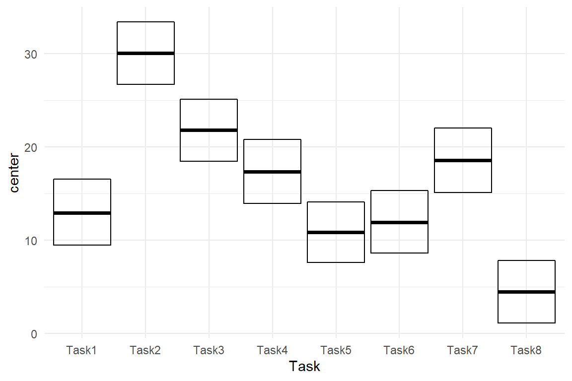
Figure 4.13: ToT on five tasks, center estimates and 95 percent credibility interval
In Figure 4.13 we can easily discover that Task 2 is by far the longest and that tasks differ a lot, overall. None of these relations can easily be seen in the CGM plot. Note that the AMM is not a different model than the treatment effects model. It is just a different parametrization, which makes interpretation easier. Both models produce the exact same predictions (except for minimal variations from the MCMC random walk).
The choice between CGM and AMM depends on whether a factor represents designed manipulations or whether it is more something that has been collected, in other words: a sample. For experimental conditions, with one default conditions, a CGM is the best choice. When the factor levels are a sample of equals, an AMM is more useful. It is for now, because in 6.5, we will see how random effects apply for non-humen populations.
–>
4.3.5 Ordered Factorial Models
Factors usually are not metric, which would require them to have an order and a unit (like years or number of errors). Age, for example, has an order and a unit, which is years. With a LRM this makes it possible to say: “per year of age, participants slow down by ….” The same cannot be said for levels of education. We could assign these levels the numbers 0, 1 and 2 to express the order, but we cannot assume that going from Low to Middle is the same amount of effective education as going from Middle to High.
One should not use LRM on a non-metric variable, AMM and CGM can be used, but actually they are too weak, because the coefficients do not represent the order.
For level of education, we could use a CGM or AMM, but the graphics and regression models will just order factors alphabetically: High, Low, Middle. Note how I first change the order of levels to over-ride alphabetical ordering. In Figure 4.14 that Low and Middle are almost on the same level of performance, whereas High education as an advantage of around 30 seconds.
attach(BrowsingAB)

BAB1$Education <- factor(as.character(BAB1$Education),
  levels = c("Low", "Middle", "High")
)

BAB1 %>%
  ggplot(aes(x = Education, y = ToT)) +
  geom_boxplot() +
  ylim(0, 250)

BAB1 %>%
  group_by(Education) %>%
  summarize(mean_ToT = mean(ToT)) %>%
  ggplot(aes(x = as.integer(Education), y = mean_ToT)) +
  geom_step() +
  scale_x_continuous(breaks = 1:3) +
  ylim(0, 250)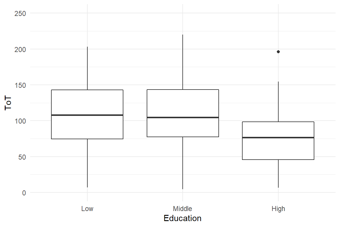
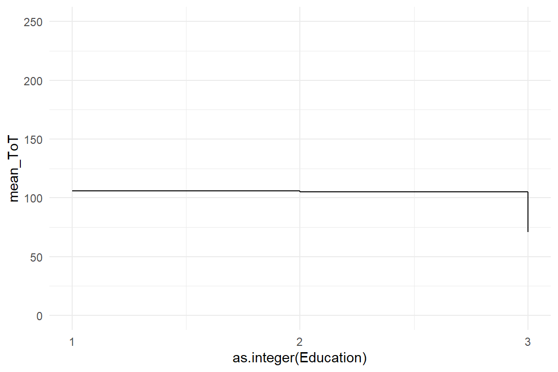
Figure 4.14: A boxplot and a step chart showing differences in ToT by level of education
Note that R also knows a separate variable type called ordered factors, which only seemingly is useful. At least, if we run a linear model with an officially ordered factor as predictor, the estimated model will be so unintelligible that I will not attempt to explain it here. Instead, we start by estimating a regular CGM with treatment contrasts (Table 4.23).
M_OFM_1 <-
  BAB1 %>%
stan_glm(ToT ~ 1 + Education, data = .)coef(M_OFM_1)| parameter | fixef | center | lower | upper |
|---|---|---|---|---|
| Intercept | Intercept | 105.989 | 95.2 | 117.0 |
| EducationMiddle | EducationMiddle | -0.654 | -15.8 | 14.6 |
| EducationHigh | EducationHigh | -34.953 | -52.5 | -16.8 |
A basic ordered factor model is just a CGM where the coefficients are shown in the desired order. The second and third coefficient carry the respective difference towards level Low. EducationHigh is not the difference towards EducationMiddle. In this case it makes sense to understand Middle and High as a smaller step or a larger step up from Low. It is not always like that. Sometimes, the only way of moving from the reference group to some other level implies going through all the intermediates, just like walking up a stairway. Then it makes more sense to use a model where coefficients are individual steps. In the IPump study, we looked at the speed of learning of a novel interface design by letting the participants repeat a set of tasks in three successive sessions. here the three sessions make a stairway: going from the fist to the third session always involves the second session. Before we come to that, we first have to see, why Session must be an ordered factor and not a metric predictor.
The first idea that could come to mind is to take session as a metric predictor and estimate a LRM – there is an ordering and it is the same amount of training per step, which you could call a unit. The thing with learning processes is that they are curved, more precisely, they gradually move towards an asymptote. The following curve shows the effect of a hypothetical training over 12 sessions. What we see is that the steps are getting smaller when training continues. While the amount of training is the same, the effect on performance declines, which is also called a curve of diminishing returns. The asymptote of this curve is the maximum performance the participant can reach, which theoretically is only reached in infinity. The following code defines an exponential learning curve function and renders the example in Figure 4.15.
learning_curve <-
  function(session, amplitude, rate, asymptote) {
    amplitude * exp(-rate * session) + asymptote
  }

tibble(session = as.integer(1:12)) %>%
  mutate(ToT = learning_curve(session, 10, .3, 2)) %>%
  ggplot(aes(x = session, y = ToT)) +
  geom_step() +
  scale_x_continuous(breaks = 1:12)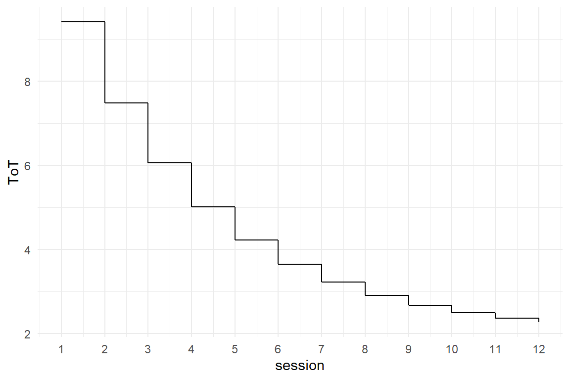
Figure 4.15: A learning curve
LRMs can only do straight lines, which means constant effects, whereas learning curves have diminishing effects. For short learning sequences, we can use ordered factorial models, where every session becomes a level. As these levels get their own coefficients, the steps no longer have to be constant. When levels are ordered, the two endpoint levels (first session, last session) can serve as a natural reference group for the intercept. However, how useful would it be to express the performance in session 3 as differences to reference level (session 1). It is more natural to think of learning to take place incrementally, like walking up stairways (or down), where the previous step always is your reference (Figure 4.16).
attach(IPump)

D_Novel %>%
  group_by(Session, session) %>%
  summarize(mean_ToT = mean(ToT)) %>%
  ggplot(aes(x = as.integer(Session), y = mean_ToT)) +
  geom_step() +
  scale_x_continuous(breaks = 1:3)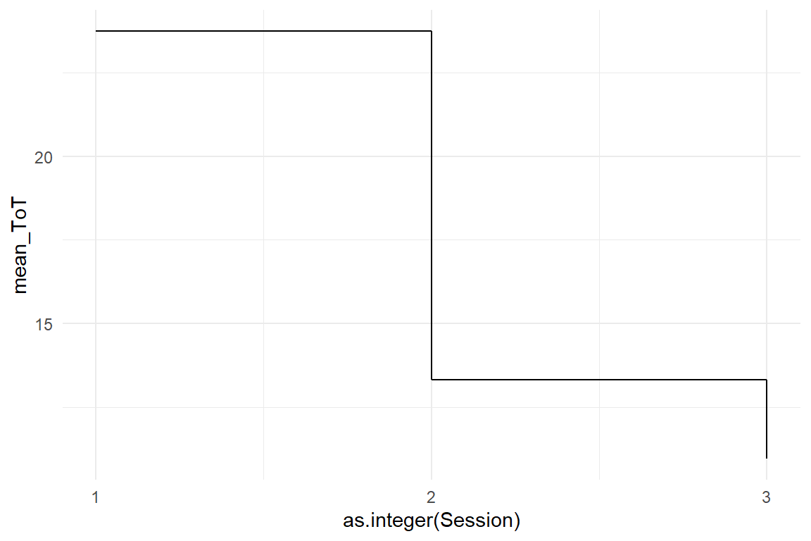
Figure 4.16: Learning to execute a task faster over three sessions.
This is what a factorial model with stairways dummy coding does. The first coefficient \(\beta_0\) is the starting point, for example the first session, and all other coefficients ( \(\beta_1, \beta_2\)) are a sequence of step sizes. The expected value \(\mu_i\) for session \(K\), using stairways dummies \(K_0, K_1, K_2\) is:
\[ \begin{aligned} \mu_i = & K_{1i} \beta_{0} &+ \\ &K_{2i} (\beta_{0} + \beta_{1}) &+\\ &K_{2i} (\beta_{0} + \beta_{1} + \beta_{2}) \end{aligned} \]
Thinking of these dummy variables as switches once again: Recall that treatment dummies have an always-on reference level and exclusive switches for the other levels 4.3.2. Stairways dummies are like a incremental switches: when switch \(K\) is on, this implies all previous switches are on, too. Stairways-down dummies are made as follows:
D_Novel <-
  D_Novel %>%
  mutate(
    Session_1 = 1,
    Step_1 = as.integer(session >= 1),
    Step_2 = as.integer(session >= 2)
  )

D_Novel %>%
  distinct(session, Session_1, Step_1, Step_2) %>%
arrange(session) | session | Session_1 | Step_1 | Step_2 |
|---|---|---|---|
| 0 | 1 | 0 | 0 |
| 1 | 1 | 1 | 0 |
| 2 | 1 | 1 | 1 |
Now we can run a factorial model using these stairway-down dummies, where the intercept is the upper floor and we are loosing height at every step (Table 4.25).
M_OFM_2 <- stan_glm(ToT ~ Session_1 + Step_1 + Step_2,
  data = D_Novel
)coef(M_OFM_2)| parameter | fixef | center | lower | upper |
|---|---|---|---|---|
| Intercept | Intercept | 23.71 | 21.55 | 25.896 |
| Step_1 | Step_1 | -10.36 | -13.31 | -7.227 |
| Step_2 | Step_2 | -2.38 | -5.39 | 0.529 |
The Intercept is the performance in the first level, which is initial performance. The first step is huge, almost reducing ToT by one half. The second step is much smaller than the first and tiny compared to initial performance. We see that high performance can be reached after just a few training sessions. Clearly, the device is easy to learn.
Another question that arises is what level of performance is reached in the end. Is maximum performance good enough, actually? Strictly, this would require a non-linear learning curve model, which would contain an estimate for maximum performance. With an OFM, the best guess we have is final performance. Because the second step was already small, we may believe that the asymptote is not so far any more. And we know that final performance is a conservative estimate for maximum performance. With a stairway-up model model, the Intercept is the basement an we walk up step-by-step (Table 4.26).
D_Novel <-
  D_Novel %>%
  mutate(
    Session_3 = 1,
    Step_1 = as.integer(session <= 1),
    Step_2 = as.integer(session <= 0)
  )

D_Novel %>%
  distinct(session, Session_3, Step_1, Step_2) %>%
  arrange(desc(session)) %>%
as_tibble()| session | Step_1 | Step_2 | Session_3 |
|---|---|---|---|
| 2 | 0 | 0 | 1 |
| 1 | 1 | 0 | 1 |
| 0 | 1 | 1 | 1 |
M_OFM_3 <- stan_glm(ToT ~ Session_3 + Step_1 + Step_2,
  data = D_Novel
)coef(M_OFM_3)| parameter | fixef | center | lower | upper |
|---|---|---|---|---|
| Intercept | Intercept | 10.93 | 8.879 | 13.01 |
| Step_1 | Step_1 | 2.42 | -0.717 | 5.44 |
| Step_2 | Step_2 | 10.33 | 7.254 | 13.41 |
The Intercept is an estimate of final performance and we can ask whether this level of efficiency is actually good enough. From a methodological perspective the results of this study indicate that it might often be worth-while to let participants do multiple session and observe the learning process. In particular, when users do their tasks routinely with a device, like the nurses, initial performance can be a very poor estimate for long-term performance.
To wrap it up: Factorial models use dummy variables to put factor levels into the linear term of a model. These dummy variables can be understood as arrays of switches, and we saw how they can be arranged in different patterns:
- Exclusive on-off switches produce an AMM. An AMM is the least specified among factorial models, all levels are equal. Often this is the best choice when the levels were drawn from a population.
- One always-on Intercept and exclusive on-off switches produces a CGM with treatment effects. When a default level can be identified, such as the placebo condition in clinical trials, treatment contrasts are a good choice.
- Stairway dummies produce an OFM, taking one end-point as first coefficient and stepping up (or down). This is particularly useful for short learning curves.
The disadvantage of an OFM is that it cannot predict how performance will improve in future sessions. In 7.2.1.2 we will see how a Poisson regression model can linearizes a learning curve and can make forecasts.
The AMM deals with a situation where a factor is under-specified to be used with treatment contrasts. It lacks the default level. Ordered factors at the opposite side, being more specific than treatment factors. Treatment factors identify one default level, but the rest are just a set. Quite often, factors also carry a natural order, such as level of education or position in a sequence of tasks.