5 Multi-predictor models
Design researchers are often collecting data under rather wild conditions. Users of municipal websites, consumer products, enterprise information systems and cars can be extremely diverse. At the same time, Designs vary in many attributes, affecting the user in many different ways. There are many variables in the game, and even more possible relations. With multi predictor models we can examine the simultaneous influence of everything we have recorded.
The first part of the chapter deals with predictors that act independent of each other: Section 5.1 demonstrates how two continuous linear predictors form a surface in a three-dimensional space. Subsequently, we address the case of multi-factorial models (5.2), which are very common in experimental research. In section 4.3.2 we have seen how linear models unite factorial with continuous predictors. This lays the ground for combining them into grouped regression models 5.3.
That being said, in reality it frequently happens that predictors are not acting independent on each other. Rather, the influence of one predictor changes dependent on the value of another predictor. In 5.4, conditional effects models will be introduced. As will turn out, by adding conditional effects a linear model is capable of rendering non-linear associations. The final section introduces polynomial regression as a general way to estimate even wildly non-linear relationship between a continuous predictor and the outcome variable.
5.1 On surface: multiple regression models
Productivity software, like word processors, presentation and calculation software or graphics programs have evolved over decades. For every new release, dozens of developers have worked hard to make the handling more efficient and the user experience more pleasant. Consider a program for drawing illustrations: basic functionality, such as drawing lines, selecting objects, moving or colourizing them, have practically always been there. A user wanting to draw six rectangles, painting them red and arranging them in a grid pattern, can readily do that using basic functionality. At a certain point of system evolution, it may have been recognized that this is what users repeatedly do: creating a grid of alike objects. With the basic functions this is rather repetitive and a new function was created, called “copy-and-arrange.” Users may now create a single object, specify rows and columns of the grid and give it a run.
The new function saves time and leads to better results. Users should be very excited about the new feature, should they not? Not quite, as (Carroll and Rosson 1987) made a very troubling observation: adding functionality for the good of efficiency may turn out ineffective in practice, as users have a strong tendency to stick with their old routines, ignoring new functionality right away. This is called the active user paradox (AUP).
Do all users behave that way? Or can we find users of certain traits that are different? What type of person would be less likely to fall for the AUP? And how can we measure resistance towards the AUP? We did a study, where we explored the impact of two user traits need-for-cognition (ncs) and geekism (gex) on AUP resistance. To measure AUP resistance we observed users while they were doing drawing tasks with a graphics software. User actions were noted down and classified by a behavioral coding scheme. From the frequencies of exploration and elaboration actions an individual AUP resistance score was derived. So, are users with high need-for-cognition and geekism more resistant to the AUP?
In Figure 5.1 we first look at the two predictors, separately:
attach(AUP)

AUP_1 %>%
  ggplot(aes(x = ncs, y = resistance)) +
  geom_point() +
  geom_smooth(method = "lm", se = F)

AUP_1 %>%
  ggplot(aes(x = gex, y = resistance)) +
  geom_point() +
  geom_smooth(method = "lm", se = F)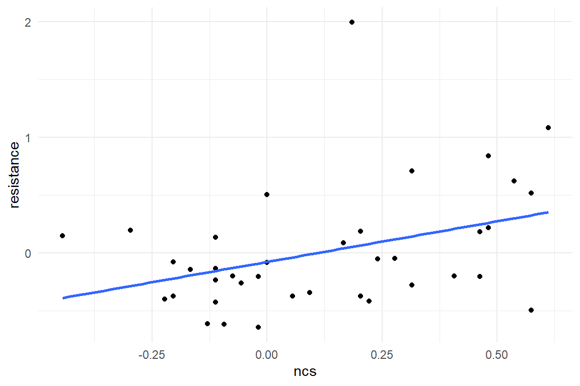
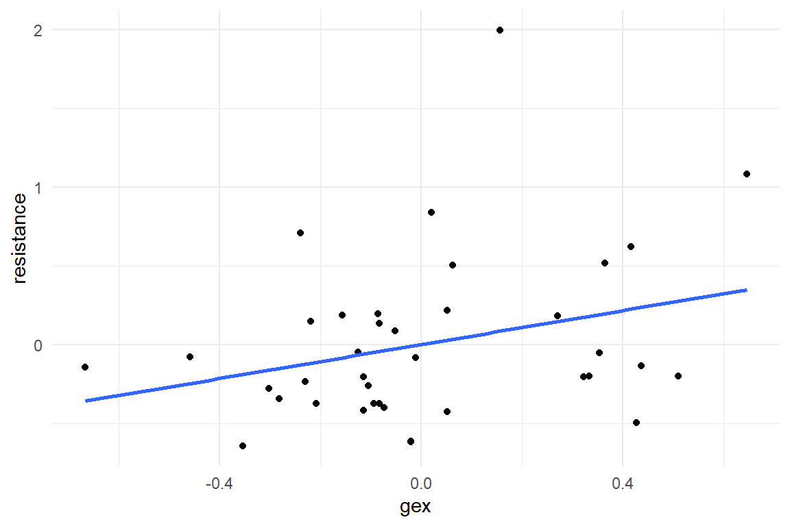
Figure 5.1: Linear associations of NCS and Gex with Resistance
As we will see, it is preferable to build one model with two simultaneous predictors, and this is what the present section is all about. Still, we begin with two separate LRMs, one for each predictor, and z-transformed scores, then we create one model with two predictors.
\[ \begin{aligned} &M1: \mu_i = \beta_0 + \beta_\mathrm{ncs} x_\mathrm{ncs}\\ &M2: \mu_i = \beta_0 + \beta_\mathrm{gex} x_\mathrm{gex} \end{aligned} \]
M_1 <-
  AUP_1 %>%
  stan_glm(zresistance ~ zncs, data = .)

M_2 <-
  AUP_1 %>%
  stan_glm(zresistance ~ zgex, data = .)
Next, we estimate a model that includes both predictors simultaneously.
The most practical property of the linear term is that we can include multiple predictor terms (and the intercept), just by forming the sum.
In this case, this is a multiple regression model (MRM):
\[ \mu_i = \beta_0 + \beta_\mathrm{ncs} x_\mathrm{ncs} + \beta_\mathrm{gex} x_\mathrm{gex} \]
In R’s regression formula language, this is similarly straight-forward.
The + operator directly corresponds with the + in the likelihood formula.
M_3 <-
  AUP_1 %>%
  stan_glm(zresistance ~ zncs + zgex, data = .) # <--
For the comparison of the three models we make use of a feature of package Bayr: the posterior distributions of arbitrary models can be combined into one multi-model posterior object, by just stacking them upon each other with bind_rows (Table 5.1). In efect, the coefficient table shows all models simultaneously (Table 5.2):
P_multi <- bind_rows(
  posterior(M_1),
  posterior(M_2),
  posterior(M_3)
)

P_multi| model | parameter | type | fixef | count |
|---|---|---|---|---|
| M_1 | Intercept | fixef | Intercept | 1 |
| M_1 | zncs | fixef | zncs | 1 |
| M_2 | Intercept | fixef | Intercept | 1 |
| M_2 | zgex | fixef | zgex | 1 |
| M_3 | Intercept | fixef | Intercept | 1 |
| M_3 | zgex | fixef | zgex | 1 |
| M_3 | zncs | fixef | zncs | 1 |
| M_1 | sigma_resid | disp | ||
| M_2 | sigma_resid | disp | ||
| M_3 | sigma_resid | disp |
coef(P_multi)| model | parameter | fixef | center | lower | upper |
|---|---|---|---|---|---|
| M_1 | Intercept | Intercept | -0.001 | -0.325 | 0.314 |
| M_1 | zncs | zncs | 0.372 | 0.065 | 0.687 |
| M_2 | Intercept | Intercept | 0.001 | -0.312 | 0.305 |
| M_2 | zgex | zgex | 0.291 | -0.034 | 0.618 |
| M_3 | Intercept | Intercept | -0.001 | -0.302 | 0.306 |
| M_3 | zncs | zncs | 0.295 | -0.079 | 0.687 |
| M_3 | zgex | zgex | 0.122 | -0.259 | 0.505 |
Now, we can easily compare the coefficients. The intercepts of all three models are practically zero, which is a consequence of the z-transformation. Recall, that the intercept in an LRM is the point, where the predictor variable is zero. In MRM this is just the same: here, the intercept is the predicted AUP resistance score, when NCS and GEX are both zero.
When using the two predictors simultaneously, the overall positive tendency remains. However, we observe major and minor shifts: in the MRM, the coefficient of the geekism score is reduced to less than half: \(0.12 [-0.26, 0.5]_{CI95}\). In contrast, the impact of NCS is reduced just by a little, compared to M_1 : \(0.29 [-0.08, 0.69]_{CI95}\).
For any researcher who has carefully conceived a research question this appears to be a disappointing outcome. Indeed, putting multiple predictors into a model sometimes reduces the size of the effect, compared to single-predictor models. More precisely, this happens, when predictors are correlated. In this study, participants who are high on NCS also tend to have more pronounced geekism (Figure 5.2))
AUP_1 %>%
  ggplot(aes(x = zncs, y = zgex)) +
  geom_point() +
  geom_smooth(method = "lm", se = F) +
  labs(title = str_c(
    "Correlation between ncs and gex: ",
    round(cor(AUP_1$zncs, AUP_1$zgex), 2)
  ))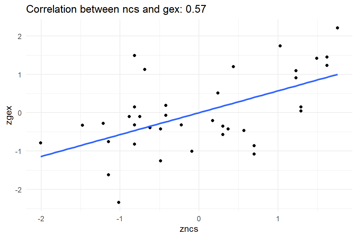
Figure 5.2: Correlated predictors Gex and NCS
Participants with a higher NCS also tend to score higher on geekism. Is that surprising? Actually, it is not. People high on NCS love to think. Computers are a good choice for them, because these are complicated devices that make you think. (Many users may even agree that computers help you think, for example when analyzing your data with R.) In turn, geekism is a positive attitude towards working with computers in sophisticated ways, which means such people are more resistant towards the AUP.
[NCS: love to think] --> [GEX: love computers] --> [resist AUP]
When such a causal chain can be established without doubt, some researchers speak of a mediating variable GEX. Although a bit outdated (Iacobucci, Saldanha, and Deng 2007), mediator analysis is correct when the causal direction of the three variables is known. The classic method to deal with mediation is a so-called step-wise regression. However, structural equation modeling (Merkle and Rosseel 2018) can be regarded a better option to deal with three or more variables that have complex causal connections (in theory).
We can exclude that the resistance test has influenced the personality scores, because of the order of appearance in the study. Unfortunately, in the situation here, the causal direction remains ambiguous for NCS and Gex. We can make up a story, like above, where NCS precedes GEX, but we can tell another story with a reversed causal connection, for example: Computers reward you for thinking hard and, hence, you get used to it and make it your lifestyle. If you like thinking hard, then you probably also like the challenge that was given in the experiment.
[GEX: love computers] --> [NCS: love to think] --> [resist AUP]
In the current case, we can not distinguish between these two competing theories with this data alone. This is a central problem in empirical research. An example, routinely re-iterated in social science methods courses is the observation that people who are more intelligent tend to consume more fresh vegetables. Do carrots make us smart? Perhaps, but it is equally plausible that eating carrots is what smart people do. The basic issue is that a particular direction of causality can only be established, when all reverse directions can be excluded by logic.
To come back to the AUP study: There is no way to establish a causal order of predictors NCS and Gex.
If nothing is known but covariation, they just enter the model simultaneously, as in model M_3.
This results in a redistribution of the overall covariance and the predictors are mutually controlled.
In M_2 the effect of GEX was promising at first, but now seems spurious in the simultaneous model.
Most of the strength was just borrowed from NCS by covariation.
The model suggests that loving-to-think has a considerably stronger association with AUP resistance than loving-computers.
That may suggest, but not prove, that NCS precedes GEX, as in a chain of causal effects, elements that are closer to the final outcome (AUP resistance) tend to exert more salient influence. But, without further theorizing and experimenting this is weak evidence of causal order.
If I would want to write a paper on geekism, NCS and the AUP, I might be tempted to report the two separate LRMs, that showed at least moderate effects. The reason why one should not do that is that separate analyses suggest that the predictors are independent. To illustrate this at an extreme example, think of a study where users were asked to rate their agreement with an interface by the following two questions, before ToT is recorded:
- Is the interface beautiful?
- Does the interface have an aesthetic appearance?
Initial separate analyses show strong effects for both predictors. Still, it would not make sense to give the report the title: “Beauty and aesthetics predict usability.” Beauty and aesthetics are practically synonyms. For Gex and NCS this may be not so clear, but we cannot exclude the possibility that they are linked to a common factor, perhaps a third trait that makes people more explorative, no matter whether it be thoughts or computers.
So, what to do if two predictors correlate strongly? First, we always report just a single model. Per default, this is the model with both predictors simultaneously. The second possibility is to use a disciplined method of model selection and remove the predictor (or predictors) that does not actually contribute to prediction. The third possibility is, that the results with both predictors become more interesting when including conditional effects 5.4.
5.2 Crossover: multifactorial models
The very common situation in research is that multiple factors are of interest. In 4.3.5, we have seen how we can use an OGM to model a short learning sequence. That was only useing half of the data, because in the IPump study, we compared two designs against each other, and both were tested in three sessions. That makes 2 x 3 conditions. Here, I introduce a multi-factorial model, that has main effects only. Such a model actually is of very limited use for the IPump case, where we need conditional effects to get to a valid model (5.4).
We take as an example the BrowsingAB study: the primary research question regarded the design difference, but the careful researcher also recorded gender of participants. One can always just explore variables that one has. The following model estimates the gender effect alongside the design effect (Table 5.3)).
attach(BrowsingAB)M_mfm_1 <-
BAB1 %>%
stan_glm(ToT ~ 1 + Design + Gender, data = .)coef(M_mfm_1)| parameter | fixef | center | lower | upper |
|---|---|---|---|---|
| Intercept | Intercept | 105.98 | 93.6 | 117.94 |
| DesignB | DesignB | -17.47 | -31.2 | -2.99 |
| GenderM | GenderM | 1.35 | -12.3 | 15.00 |
By adding gender to the model, both effects are estimated simultaneously. In the following multi-factorial model (MFM) the intercept is a reference group, once again. Consider that both factors have two levels, forming a \(2 x 2\) matrix, like Table 5.4).
tribble(
  ~Condition, ~F, ~M,
  "A", "reference", "difference",
  "B", "difference", ""
) | Condition | F | M |
|---|---|---|
| A | reference | difference |
| B | difference |
The first one, A-F, has been set as reference group. In Table 5.4 the intercept coefficient tells that women in condition A have an average ToT of \(105.98 [93.65, 117.94]_{CI95}\) seconds. The second coefficient says that design B is slightly faster and that there seemingly is no gender effect.
How comes that the model only has three parameters, when there are four groups? In a CGM, the number of parameters always equals the number of levels, why not here? We can think of the 2 x 2 conditions as flat four groups, A-F, A-M, B-F and B-M and we would expect four coefficients, say absolute group means. This model regards the two effects as independent, that means they are not influencing each other: Design is assumed to have the same effect for men and women.
In many multi-factorial situations, one is better advised to use a model with conditional effects. Broadly, with conditional effect we can assess, how much effects influence each other. We will come back to that, but here I am introducing an extension of the AMM (4.3.4), the multifactorial AMM (MAMM):
M_amfm_1 <- stan_glm(ToT ~ 0 + Design:Gender, data = BAB1)The R formula for an AMM supresses the intercept and uses an interaction term without main effects (as will be explained in 5.4.2). Table 5.5 carries the four group means and be can further processed as a conditional plot, as in Figure 5.3.
coef(M_amfm_1)| parameter | fixef | center | lower | upper |
|---|---|---|---|---|
| DesignA:GenderF | DesignA:GenderF | 104.3 | 89.5 | 119 |
| DesignB:GenderF | DesignB:GenderF | 89.9 | 75.5 | 104 |
| DesignA:GenderM | DesignA:GenderM | 108.4 | 95.1 | 122 |
| DesignB:GenderM | DesignB:GenderM | 88.8 | 75.8 | 102 |
coef(M_amfm_1) %>%
  separate(parameter, into = c("Design", "Gender")) %>%
  ggplot(aes(x = Design, col = Gender, y = center)) +
  geom_point(size = 2) +
  geom_line(aes(group = Gender))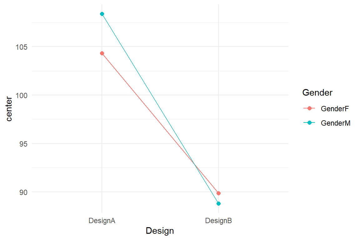
Figure 5.3: Line graph showing conditional effects in a tow-factorial model
If the two effects were truly independent, these two lines had to be parallel, because the effect of Gender had to be constant.
What this graph now suggests is that there is an interaction between the two effects.
There is a tiny advantage for female users with design A, whereas men are faster with B with about the same difference.
Because these two effects cancel each other out, the combined effect of Gender in model M_mfm_1 was so close to zero.
5.3 Line-by-line: grouped regression models
Recall, that dummy variables make factors compatible with linear regression. We have seen how two metric predictors make a surface and how factors can be visualized by straight lines in a conditional plot. When a factor is combined with a metric predictor, we get a group of lines, one per factor level. For example, we can estimate the effects of age and design simultaneously, as shown in Table 5.6.
attach(BrowsingAB)M_grm_1 <-
BAB1 %>%
stan_glm(ToT ~ 1 + Design + age_shft, data = .)coef(M_grm_1)| parameter | fixef | center | lower | upper |
|---|---|---|---|---|
| Intercept | Intercept | 82.035 | 66.435 | 96.85 |
| DesignB | DesignB | -17.381 | -30.354 | -3.67 |
| age_shft | age_shft | 0.817 | 0.413 | 1.22 |
Once again, we get an intercept first. Recall, that in LRM the intercept is the the performance of a 20-year old (age was shifted!). In the CGM the intercept is the mean of the reference group. When marrying factors with continuous predictors, the intercept is point zero in the reference group. The predicted average performance of 20-year old with design A is \(82.03 [66.44, 96.85]_{CI95}\). The age effect has the usual meaning: by year of life, participants get \(0.82 [0.41, 1.22]_{CI95}\) seconds slower. The factorial effect B is a vertical shift of the intercept. A 20-year old in condition B is \(17.38 [30.35, 3.67]_{CI95}\) seconds faster.
It is important to that this is a model of parallel lines, implying that the age effect is the same everywhere. The following model estimates intercepts and slopes separately for every level, making it an absolute mixed-predictor model (AMPM). The following formula produces such a model and results are shown in Table 5.7.
M_ampm_1 <- stan_glm(ToT ~ (0 + Design + Design:age_shft),
  data = BAB1
)coef(M_ampm_1)| parameter | fixef | center | lower | upper |
|---|---|---|---|---|
| DesignA | DesignA | 99.435 | 79.884 | 119.042 |
| DesignB | DesignB | 46.298 | 26.843 | 65.444 |
| DesignA:age_shft | DesignA:age_shft | 0.233 | -0.346 | 0.813 |
| DesignB:age_shft | DesignB:age_shft | 1.420 | 0.854 | 1.980 |
It turns out, the intercepts and slopes are very different for the two designs. For a 20 year old, design B works much better, but at the same time design B puts a much stronger penalty on every year of age. With these coefficients we can also produce a conditional plot, with one line per Design condition (Figure 5.4).
coef(M_ampm_1) %>%
  select(fixef, center) %>%
  mutate(
    Design = str_extract(fixef, "[AB]"),
    Coef = if_else(str_detect(fixef, "age"),
      "Slope",
      "Intercept"
    )
  ) %>%
  select(Design, Coef, center) %>%
  spread(key = Coef, value = center) %>%
  ggplot() +
  geom_abline(aes(
    color = Design,
    intercept = Intercept,
    slope = Slope
  )) +
  geom_point(data = BAB1, aes(
    x = age,
    col = Design,
    y = ToT
  ))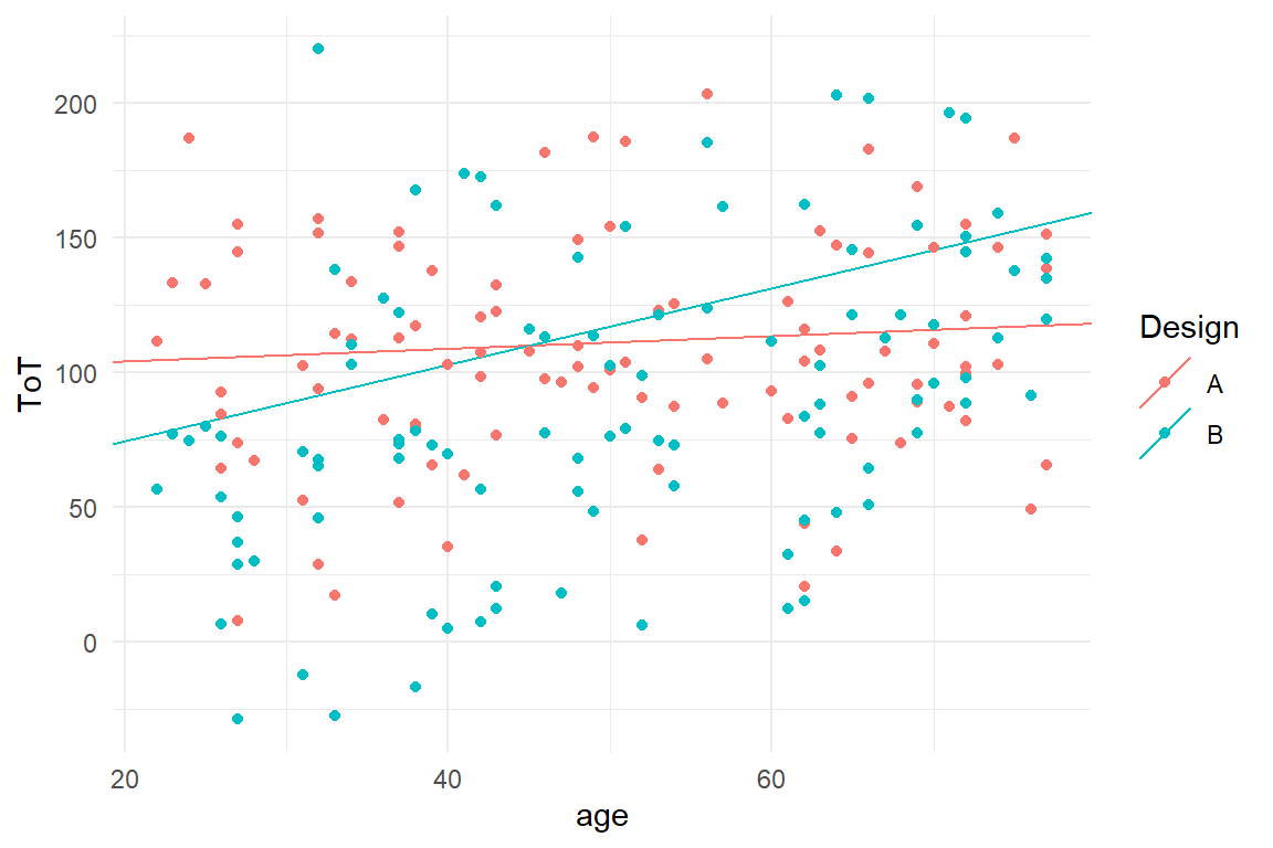
Figure 5.4: Creating a conditional plot from intercept and slope effects
Note
- how the coefficient table is first made flat with
spread, where Intercept and Slope become variables. - that the Abline geometry is specialized on plotting linear graphs, but it requires its own aesthetic mapping (the global will not work).
So, if we can already fit a model with separate group means (an AMFM) or a bunch of straight lines (AMPM), why do we need a more elaborate account of conditional effects, as in chapter 5.4.2? The answer is that conditional effects often carry important information, but are notoriously difficult to interpret. As it will turn out, conditional effects sometimes are due to rather trivial effects, such as saturation. But, like in this case, they can give the final clue. It is hard to deny that design features can work differently to different people. The hypothetical situation is BrowsingAB is that design B uses a smaller font-size, which makes it harder to read with elderly users, whereas younger users have a benefit from more compactly written text.
And, sometimes, experimental hypotheses are even formulated as conditional effects, like the following: some control tasks involve long episodes of vigilance, where mind wandering can interrupt attention on the task. If this is so, we could expect people who meditate to perform better at a long duration task, but showing no difference at short tasks. In a very simple experiment participants reaction time could be measured in a long and short task condition.
5.4 Conditional effects models
With the framework of MPM, we can use an arbitrary number of predictors. These can represent properties on different levels, for example, two design proposals for a website can differ in font size, or participants differ in age. So, with MPM we gain much greater flexibility in handling data from applied design research, which allows us to examine user-design interactions more closely.
The catch is that if you would ask an arbitrary design researcher:
Do you think that all users are equal? Or, could it be that one design is better for some users, but inferior for others?
you would in most cases get the answer:
Of course users differ in many ways and it is crucial to know your target group.
Some will also refer to the concept of usability by the ISO 9241-11, which contains the famous phrase:
“… for a specified user …”
The definition explicitly requires you to state for for whom you intended to design. It thereby implicitly acknowledges that usability of a design could be very different for another user group. Statements on usability are by the ISO 9241-11 definition conditional on the target user group.
In statistical terms, conditional statements have this form:
the effect of design depends on the user group.
In regression models, conditional statements like these are represented by conditional effects. Interactions between user properties and designs are central in design research, and deserve a neologism: differential design effects models (DDM).
However, conditional effects are often needed for a less interesting reason: saturation occurs when physical (or other) boundaries are reached and the steps are getting smaller, for example, the more you train, the less net effect it usually has. Saturations counter part is amplification, a rare one, which acts like compound glue: it will harden only if the two components are present.
5.4.1 Conditional multiple regression
In section 4.2 we have seen how the relationship between predictor and outcome variable can be modelled as a linear term. We analysed the relationship between age and ToT in the (fictional) BrowsingAB case and over both designs combined and observed just a faint decline in performance, which also seemed to take a wavey form.
It is commonly held that older people tend to have lower performance than younger users. A number of factors are called responsible, such as: slower processing speed, lower working memory capacity, lower motor speed and visual problems. All these capabilities interact with properties of designs, such as legibility, visual simplicity and how well the interaction design is mapped to a user’s task. It is not a stretch to assume that designs can differ in how much performance degrades with age.
In turn, a design can also contain compromises that limit the performance of younger users. For example, the main difference between design A and B in the BrowsingAB example is that A uses larger letters than B. Would that create the same benefit for everybody? It is not unlikely, that larger letters really only matter for users that have issues with vision. Unfortunately, large letters have an adverse side-effect for younger users, as larger font size takes up more space on screen and more scrolling is required. In Figure 5.5, we take a first look at the situation.
attach(BrowsingAB)

BAB1 %>%
  ggplot(aes(
    x = age,
    col = Design,
    y = ToT
  )) +
  geom_point() +
  geom_smooth(se = F) +
  geom_smooth(aes(col = "combined"), se = F)
Figure 5.5: The effect of age, combined and conditional on Design
The graph suggests that designs A and B differ in the effect of age.
Design B appears to perform much better with younger users.
At the same time, it seems as if A could be more favorable for users at a high age.
By adding the conditional effect Design:age_shft the following model estimates the linear relationship for the designs separately.
This is essentially the same model as the absolute mixed-predictor model M_ampm_1 5, which also had four coefficients, the intercepts and slopes of two straight lines.
We have already seen how the GRM and the AMPM produce different fitted responses.
Predictions are independent of contrast coding, but coefficients are not.
The following conditional model uses treatment contrasts, like the GRM, and we can compare the coefficients side-by-side (Table 5.8).
M_cmrm <-
  BAB1 %>%
  stan_glm(ToT ~ Design + age_shft + Design:age_shft,
    data = .
  )
P_comb <-
bind_rows(
posterior(M_grm_1),
posterior(M_cmrm)
)
coef(P_comb)| model | parameter | fixef | center | lower | upper |
|---|---|---|---|---|---|
| M_cmrm | Intercept | Intercept | 99.992 | 80.392 | 119.858 |
| M_cmrm | DesignB | DesignB | -53.112 | -80.641 | -25.913 |
| M_cmrm | age_shft | age_shft | 0.219 | -0.346 | 0.805 |
| M_cmrm | DesignB:age_shft | DesignB:age_shft | 1.191 | 0.405 | 2.007 |
| M_grm_1 | Intercept | Intercept | 82.035 | 66.435 | 96.848 |
| M_grm_1 | DesignB | DesignB | -17.381 | -30.354 | -3.670 |
| M_grm_1 | age_shft | age_shft | 0.817 | 0.413 | 1.222 |
The conditional model shares the first three coefficients with the unconditional model, but only the first two, Intercept and DesignB have the same meaning.
The intercept is the performance of an average twenty-year-old using design A, but the two models diverge in where to place this and the conditional model is less in favor of design A (\(99.99 [80.39, 119.86]_{CI95}\) seconds). Conversely, the effect of design B at age of 20 improved dramatically: accordingly, a twenty-year-old is \(53.11 [80.64, 25.91]_{CI95}\) faster with B.
The third coefficient Age_shift appears in both models, but really means something different.
The GRM assumes that both designs have the same slope of \(0.82\) seconds per year.
The conditional model produces one slope per design and here the coefficient refers to design A only, as this is the reference group.
Due to the treatment effects, DesignB:age_shft is the difference in slopes: users loose \(0.82\) seconds per year with A, and on top of that \(0.22 [-0.35, 0.81]_{CI95}\) with design B.
5.4.2 Conditional multifactorial models
In a conditional multifactorial model (CMFM), the effect of one factor level, depends on depends on the level on another factor.
A full CMFM has as many coefficients as there are multi-level groups and is flexible enough that all group means can be completely independent, just like an AMM does it.
Let us see this on an almost trivial example, first.
In the fictional BrowsingAB case, a variable rating has been gathered.
Let us imagine this be a vague emotional rating in the spirit of user satisfaction.
Some claim that emotional experience is what makes the sexes different, so one could ask whether this makes a difference for the comparison two designs A and B (Figure 5.6).
attach(BrowsingAB)BAB1 %>%
ggplot(aes(y = rating, x = Gender, color = Design)) +
geom_boxplot()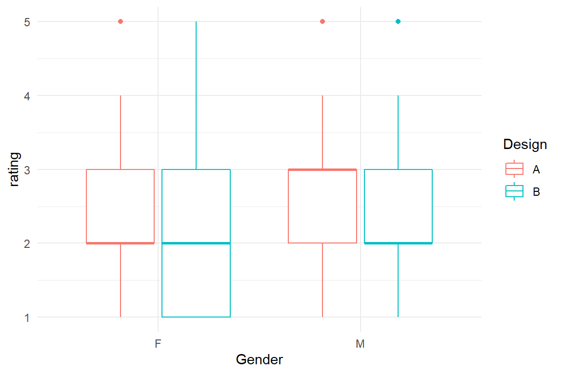
Figure 5.6: Comparing satisfaction ratings by design and gender
In a first exploratory plot it looks like the ratings are pretty consistent across gender, but with a sensitive topic like that, we better run a model, or rather two, a plain MFM and a conditional MFM:
M_mfm_2 <-
  BAB1 %>%
  stan_glm(rating ~ Design + Gender,
    data = .
  )

M_cmfm_1 <-
  BAB1 %>%
  stan_glm(rating ~ Design + Gender + Design:Gender,
    data = .
  )

# T_resid <- mutate(T_resid, M_ia2 = residuals(M_ia2))bind_rows(
posterior(M_mfm_2),
posterior(M_cmfm_1)
) %>%
coef() %>%
ggplot(aes(
y = parameter, col = model,
xmin = lower, xmax = upper, x = center
)) +
geom_crossbar(position = "dodge") +
labs(x = "effect")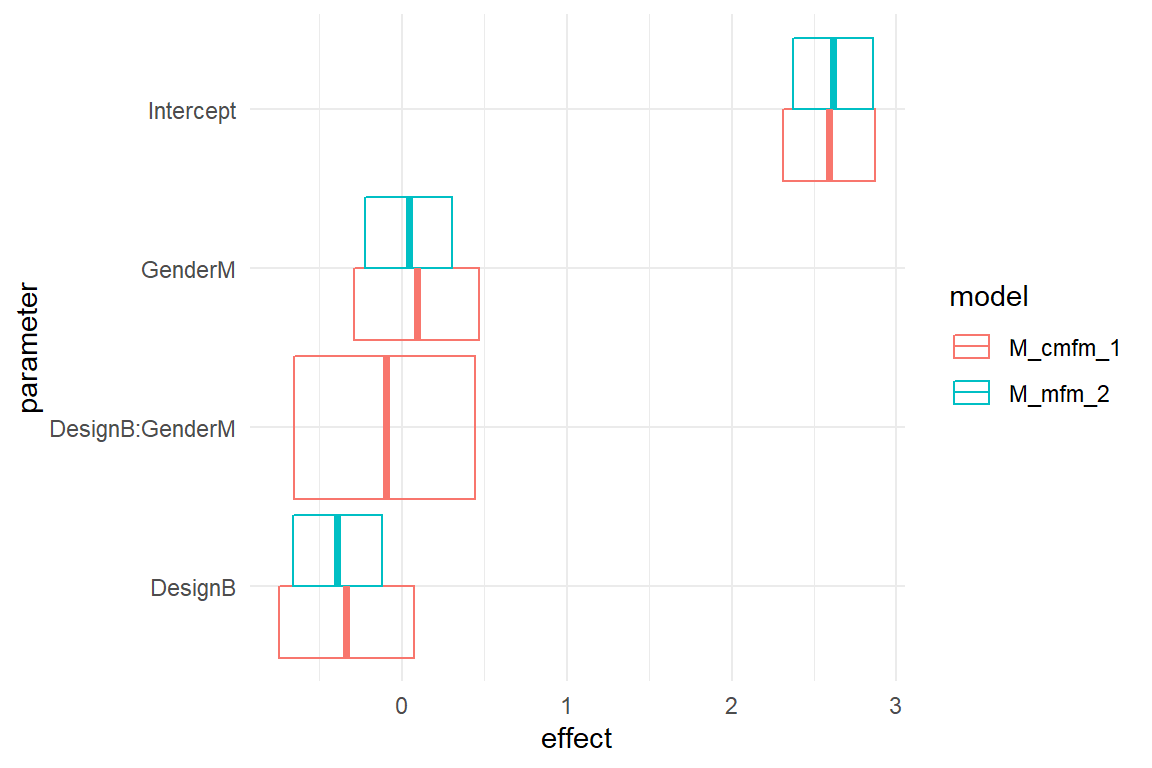
Figure 5.7: Comparison of non-conditional and conditionbal two-factorial models, center estimates and 95 percent credibility intervals
The CLU plots above show both models in comparison. Both models use treatment effects and put the intercept on female users with design A. We observe that there is barely a difference in the estimated intercepts. The coefficient DesignB means something different in the models: in the MFM it represents the difference between Designs. In the CMFM, it is the difference design B makes for female users. The same is true for GenderM: In the MFM it is the gender effect, whereas in the CMFM it is the the gender difference for design A.
A note on terminology: many researchers divide the effect of conditional models into main effects (DesignB, GenderM) and interaction effects. That it is incorrect, because DesignB and GenderM are not main, in the sense of global. That is precisely what a conditional model does: it makes two (or more) local effects out of one global effect.
None of the three coefficients of the MFM noticably changed by introducing the conditional effect DesignB:GenderM.
Recall that in the MFM, the group mean of design B among men is calculated by adding the two main effects to the intercept.
This group mean is fixed.
The conditional effect DesignB:GenderM is the difference to the fixed group in the MFM.
It can be imagined as an adjustment parameter, that gives the fourth group its own degree of freedom.
In the current CMFM the conditional coefficient is very close to zero, with a difference of just \(-0.1 [-0.65, 0.44]_{CI95}\).
It seems we are getting into a lot of null results here. If you have a background in classic statistics, you may get nervous at such a point, because you remember that in case of null results someone said: “one cannot say anything.” This is true when you are testing null hypotheses and divide the world into the classes significant/non-significant. But, when you interpret coefficients, you are speaking quantities and zero is a quantity. What the MFM tells us is that male users really don’t give any higher or lower ratings, in total, although there remains some uncertainty.
Actually, the purpose of estimating a CMFM can just be to show that some effect is unconditional. As we have seen earlier 5.2, conditional effects can cancel each other out, when combined into global effects. Take a look at the following hypothetical results of the study. Here, male and female users do not agree. If we would run an MFM in such a situation, we would get very similar coefficients, but would overlook that the relationship between design and rating is just poorly rendered (Figure 5.8).
tribble(
  ~Design, ~Gender, ~mean_rating,
  "A", "F", 5.6,
  "A", "M", 5.6 + .4,
  "A", "Total", mean(c(5.6, 6.0)),
  "B", "F", 5.6 - .3,
  "B", "M", 5.6 + .4 - .3 - .6,
  "B", "Total", mean(c(5.3, 5.1))
) %>%
  ggplot(aes(x = Design, col = Gender, y = mean_rating)) +
  geom_point(size = 2) +
  geom_line(aes(group = Gender))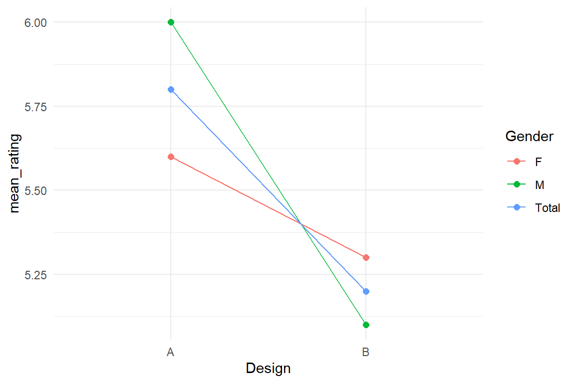
Figure 5.8: Total versus conditional effects in a factorial model
If something like this happens in a real design study, it may be a good idea to find out, why this difference appears and whether there is a way to make everyone equally happy. These are questions a model cannot answer. But a CMFM can show, when effects are conditional and when they are not. Much of the time, gender effects is what you rather don’t want to have, as it can become a political problem. If conditional adjustment effects are close to zero, that is proof (under uncertainty) that an effect is unconditional. That actually justifies the use of an MFM with global effects, only.
Let’s see a more complex example of conditional MFMs, where conditional effects are really needed. In the IPump study, two infusion pump designs were compared in three successive sessions. In 4.3.5 we saw how a factorial model can render a learning curve using stairway dummies. With two designs, we can estimate separate learning curves and make comparisons. Let’s take a look at the raw data in Figure 5.9.
attach(IPump)D_agg %>%
group_by(Design, Session) %>%
summarize(mean_ToT = mean(ToT)) %>%
ggplot(aes(x = Session, y = mean_ToT, color = Design)) +
geom_point() +
geom_line(aes(group = Design)) +
ylim(0, 350)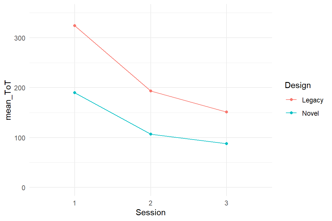
Figure 5.9: ToT by design and session
We note that the learning curves do not cross, but are not parallel either, which means the stairway coefficients will be different. We need a conditional model.
The first choice to make is between treatment dummies and stairway dummies (4.3.2, 4.3.5) both have their applications. With treatment effects, we would get an estimate for the total learning between session 1 and 3. That does not make much sense here, but could be interesting to compare trainings by the total effect of a training sequence.
We’ll keep the stairway effects on the sessions, but have to now make a choice on where to fix the intercept, and that depends on what aspect of learning is more important. If this were any walk-up-and-use device or a website for making your annual tax report, higher initial performance would indicate that the system is intuitive to use. Medical infusion pumps are used routinely by trained staff. Nurses are using infusion pumps every day, which makes long-term performance more important. The final session is the best estimate we have for that. We create stairway dummies for session and make this conditional on Design. The results are shown in Table 5.9.
T_dummy <-
  tribble(
    ~Session, ~Session_3, ~Step3_2, ~Step2_1,
    "1", 1, 1, 1,
    "2", 1, 1, 0,
    "3", 1, 0, 0
  )

D_agg <-
  left_join(D_agg,
    T_dummy,
    by = "Session",
    copy = T
  ) %>%
  select(Obs, Design, Session, Session_3, Step3_2, Step2_1, ToT)
M_cmfm_2 <-
stan_glm(ToT ~ 1 + Design + Step3_2 + Step2_1 +
Design:(Step3_2 + Step2_1), data = D_agg)coef(M_cmfm_2)| parameter | fixef | center | lower | upper |
|---|---|---|---|---|
| Intercept | Intercept | 151.1 | 119.406 | 180.4 |
| DesignNovel | DesignNovel | -63.6 | -105.107 | -19.4 |
| Step3_2 | Step3_2 | 41.8 | 0.363 | 84.9 |
| Step2_1 | Step2_1 | 131.4 | 87.140 | 172.4 |
| DesignNovel:Step3_2 | DesignNovel:Step3_2 | -22.4 | -84.576 | 35.1 |
| DesignNovel:Step2_1 | DesignNovel:Step2_1 | -48.2 | -106.155 | 12.6 |
Note that …
- here I demonstrate a different technique to attach dummies to the data. First a coding table
T_dummyis created, which is then combined with the data, using a (tidy) join operation. - we have expanded the factor Session into three dummy variables and we have to make every single one conditional.
Design:(Step3_2 + Step2_1)is short forDesign:Step3_2 + Design:Step2_1. But, you should never use the fully factorial expansion (Factor1 * Factor2), a this would make dummy variables conditional.
In conditional learning curve model, the intercept coefficient tells us that the average ToT with the Legacy in the final session is \(151.11 [119.41, 180.38]_{CI95}\) seconds. Using the Novel design the nurses were \(63.61 [105.11, 19.37]_{CI95}\) seconds faster and that is our best estimate for the long-term improvement in efficiency.
Again, the learning step coefficients are not “main” effects, but is local to Legacy.
The first step Step2_1 is much larger than the second, as is typical for learning curves.
The adjustment coefficients for Novel have the opposite direction, meaning that the learning steps in Novel are smaller.
That is not as bad as it sounds, for two reasons: first, in this study, the final performance counts, not the training progress.
Second, and more generally, we have misused a linear model to smooth a non-linear model.
Learning processes are exponential (7.2.1.2).
Learning curves are saturation processes, which can look linear when viewed in segments, but unlike linear models, they never cross the lower boundary. This is simply, because there is a maximum performance limit, which can only be reached asymptotically. In the following section, I will argue that basically all measures we take have natural boundaries. Under common circumstances, this can lead to conditional effects which are due to saturation.
5.4.3 Saturation: hitting the boundaries
Recall taht the three main assumptions of linear regression are Normal distributed residuals, variance homogeneity and linearity. The last arises from the basic regression formula:
\[ y_i = \beta_0 + \beta_1 x_{1i} \]
The formula basically says, that if we increase \(x_1\) (or any other influencing variable) by one unit, \(y\) will increase by \(\beta_1\). It also says that \(y\) is composed as a mere sum. In this section, we will discover that these innocent assumptions often do not hold.
In this and the next section, we will use conditional effects to account for non-linearity. We can distinguish between saturation effects, which are more common, and amplification effects. Figure 5.10 shows two attempts at visualizing saturation (and amplification).
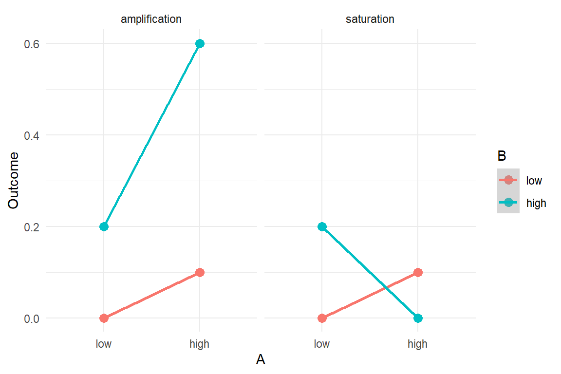
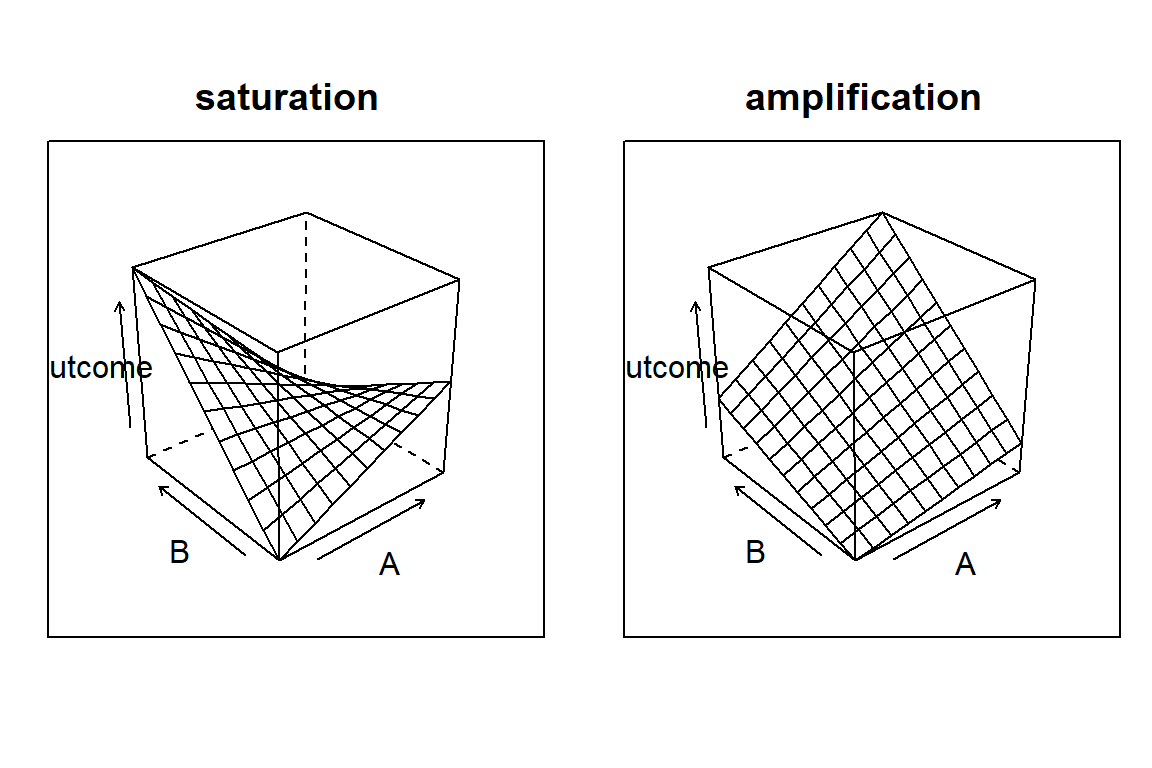
Figure 5.10: Two forms of conditional effects: amplification and saturation
A major flaw with the linear model is that it presumes the regression line to rise or fall infinitely. However, in an endless universe everything has boundaries. Just think about your performance in reading this text. Several things could be done to improve reading performance, such as larger font size, simpler sentence structure or translation into your native language. Still, there is a hard lower limit for time to read, just by the fact, that reading involves saccades (eye movements) and these cannot be accelerated any further. The time someone needs to read a text is limited by fundamental cognitive processing speed. We may be able to reduce the inconvenience of deciphering small text, but once an optimum is reached, there is no further improvement. Such boundaries of performance inevitably lead to non-linear relationships between predictors and outcome.
Modern statistics knows several means to deal with non-linearity, some of them are introduced in 7). Still, most researchers use linear models, and it often can be regarded a reasonable approximation under particular circumstances. Mostly, this is that measures keep a distance to the hard boundaries, to avoid saturation.
When there is just one treatment repeatedly pushing towards a boundary, we get the diminishing returns effect seen in learning curves 4.3.5. If two or more variables are pushing simultaneously, saturation can appear, too. Letter size and contrast both influence the readability of a text, but once the letters are huge, contrast no longer matters.
Before we turn to a genuine design research case, let me explain saturation effects by an example that I hope is intuitive. The hypothetical question is: do two headache pills have twice the effect of one? Consider a pharmaceutical study on the effectiveness of two pain killer pills A and B. The day after a huge campus party, random strolling students have been asked to participate. First, they rate their experienced headache on a Likert scale ranging from “fresh like the kiss of morning dew” to “dead possum on the highway.” Participants are randomly assigned to four groups, each group getting a different combination of pills: no pill, only A, only B, A and B. After 30 minutes, headache is measured again and the difference between both measures is taken as the outcome measure: headache reduction. Figure
attach(Headache)

T_means <-
  Pills %>%
  group_by(PillA, PillB) %>%
  summarise(mean_reduction = round(mean(reduction), 1))

T_means %>%
  ggplot(aes(x = PillA, col = PillB, mean_reduction)) +
  geom_point() +
  geom_line(aes(group = PillB)) +
  ylim(0, 2.5)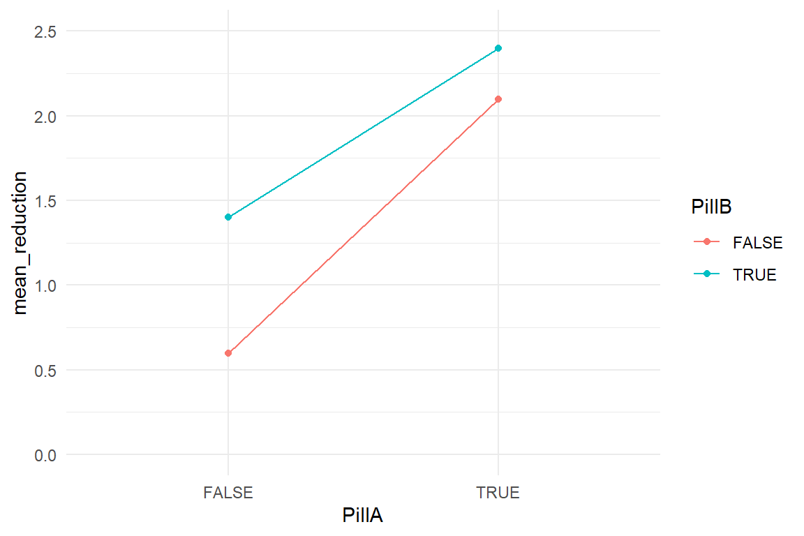
Figure 5.11: Group means of a two-factorial model
When neither pill is given a slight spontaneous recovery seems to occur. Both pills alone are much stronger than the placebo and when giving them both, participants recover the best. However, looking more closely, the effect of wto pills is just a tad stronger than the effect of A and stays far from being the sum. One could also say, that the net effect of B is weaker when given together with A. When the effect of one predictor depends on the level of another, this is just a conditional effect.
So, why is the effect of two pills not the sum of the two one-pill effects? This question can be answered by contemplating what may happen when not two but five headache pills are given. If we would assume linear addition of effects, we also have to assume that participants in the group with all pills make the breathtaking experience of negative headache. So, certainly, the effect cannot be truly linear. Al headache pills are pushing into the direction of the boundary called absence of headache.
At the example of headache pills, I will now demonstrate that saturation can cause a severe bias when not accounted for by a conditional effect. We estimate both models: a factorial unconditional MFM and a conditional MFM. Table 5.10 puts the center estimates of both models side-by-side.
M_mfm <- stan_glm(reduction ~ 1 + PillA + PillB,
  data = Pills
)
M_cmfm <- stan_glm(reduction ~ 1 + PillA + PillB + PillA:PillB,
  data = Pills
)

P_1 <- bind_rows(
  posterior(M_mfm),
  posterior(M_cmfm)
)coef(P_1) %>%
select(model, fixef, center) %>%
spread(key = model, value = center) %>%
# mutate(diff = M_cmfm - M_mfm) | fixef | M_1 |
|---|---|
| Intercept | 106 |
Both intercepts indicate that headache diminishes due to the placebo alone, but M_mfm over-estimates spontaneous recovery.
At the same time, the treatment effects PillA and PillB are under-estimated by M_mfm.
That happens, because the unconditional model averages over two conditions, under which pill A or B are given: with the other pill or without.
As M_cmfm tells, when taken with the another pill, effectiveness is reduced by \(-0.4\).
This example shows that multi-predictor models can severely under-estimate effect strength of individual impact variables, when effects are conditional.
In general, if two predictors work into the same direction (here the positive direction) and the consitional adjustment effect has the opposite direction, this is most likely a saturation effect: the more of similar is given, the closer it gets to the natural boundaries and the less it adds.
Remember that this is really not about side effects in conjunction with other medicines. Quite the opposite: if two type of pills effectively reduce headache, but in conjunction produce a rash, this would actually be an amplification effect 5.4.4. Whereas amplification effects are theoretically interesting, not only for pharmacists, saturation effects are a boring nuisance stemming from the basic fact that there always are boundaries of performance. Saturation effects only tell us that we have been applying more of the similar and that we are running against a set limit of how much we can improve things.
Maybe, saturation affects are not so boring for design research. A saturation effect indicates that two impact factors work in a similar way. That can be used to trade one impact factor for another. There is more than one way to fight pain. Distraction or, quite the opposite, meditation can also reduce the suffering. Combining meditation practice with medication attacks the problem from different angles and that may add up much better than taking more pills. For people who are allergic to pill A, though, it is good that B is a similar replacement.
If two design impact factors work in similar ways, we may also be able to trade in one for the other. Imagine a study aiming at ergonomics of reading for informational websites. In a first experiment, the researcher found that 12pt font effectively reduces reading time as compared to 10pt by about 5 seconds. But, is it reasonable to believe that increasing to 18pt would truly reduce reading time to 15 seconds?
D_reading_time <-
  tibble(
    font_size = c(4, 10, 12, 14, 16, 18),
    observed_time = c(NA, 40, 30, NA, NA, NA),
    predicted_time = 60 - font_size / 4 * 10
  )

D_reading_time| font_size | observed_time | predicted_time |
|---|---|---|
| 4 | 50 | |
| 10 | 40 | 35 |
| 12 | 30 | 30 |
| 14 | 25 | |
| 16 | 20 | |
| 18 | 15 |
Probably not. For normally sighted persons, a font size of 12 is easy enough to decipher and another increase will not have the same effect.
Researching the effect of font sizes between 8pt and 12pt font size probably keeps the right distance, with approximate linearity within that range. But what happens if you bring a second manipulation into the game with a functionally similar effect? For example, readability also improves with contrast.
A common conflict of interests is between the aesthetic appearance and the ergonomic properties. From an ergonomic point of view, one would probably favor a typesetting design with crisp fonts and maximum contrast. However, if a design researcher would suggest using 12pt black Arial on white background as body font, this is asking for trouble with anyone claiming a sense of beauty. Someone will insist on a fancy serif font in an understating blueish-grey tone. For creating a relaxed reading experience, the only option left is to increase the font size.
The general question arises: can one sufficiently compensate lack of contrast by setting the text in the maximum reasonable font size 12pt, as compared to the more typical 10pt? In the fictional study Reading, a 2x2 experimental study has been simulated: the same page of text is presented in four versions, with either 10pt or 12pt, and grey versus black font colour.
attach(Reading)

D_1| Obs | Part | font_size | font_color | mu | ToT |
|---|---|---|---|---|---|
| 1 | 1 | 10pt | gray | 60 | 66.9 |
| 2 | 2 | 12pt | gray | 48 | 45.2 |
| 12 | 12 | 12pt | gray | 48 | 59.4 |
| 23 | 23 | 10pt | black | 50 | 49.1 |
| 24 | 24 | 12pt | black | 46 | 52.1 |
| 25 | 25 | 10pt | black | 50 | 59.5 |
| 26 | 26 | 12pt | black | 46 | 43.8 |
| 34 | 34 | 12pt | black | 46 | 43.0 |
D_1 %>%
  ggplot(aes(
    col = font_color,
    x = font_size,
    y = ToT
  )) +
  geom_boxplot()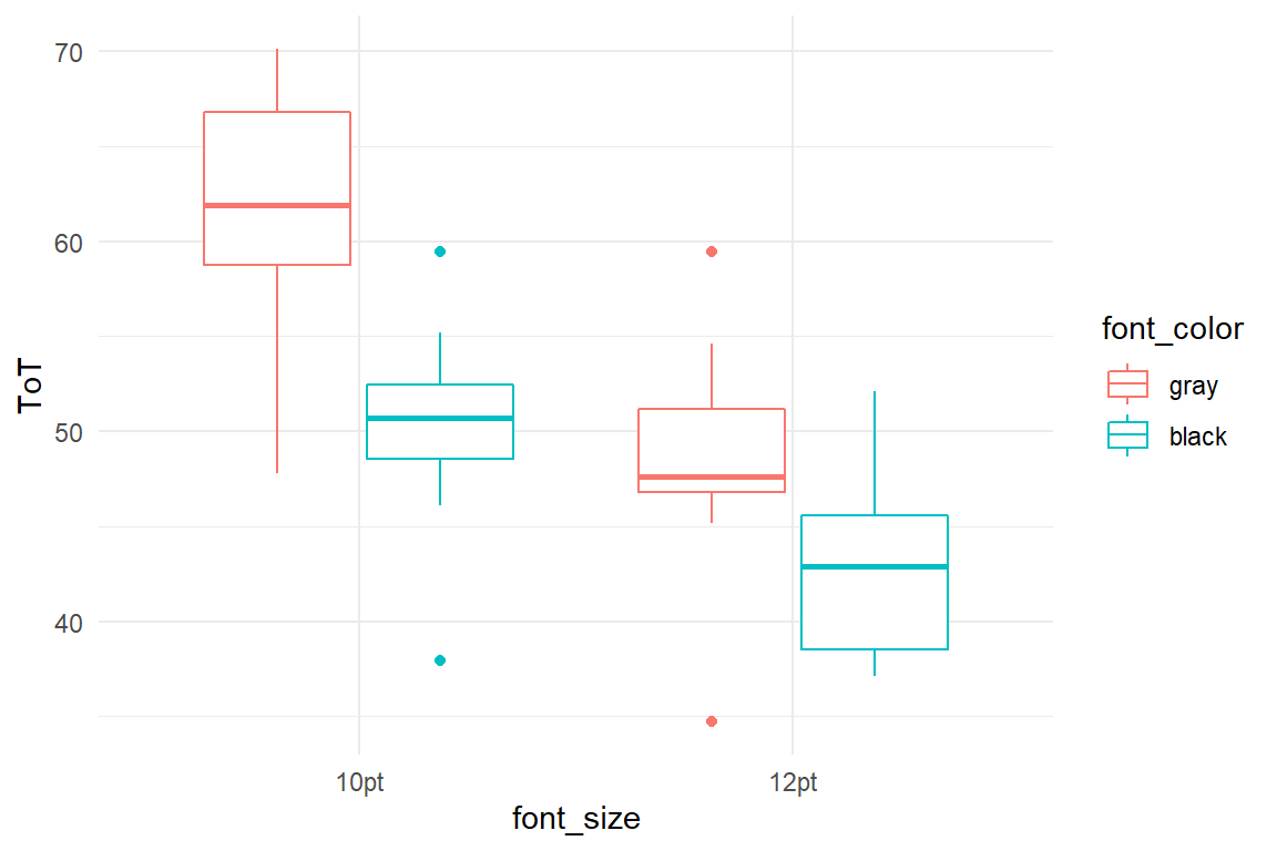
Figure 5.12: A boxplot showing groups in a 2x2 experiment.
In Figure 5.12 we see , that both design choices have an impact: black letters, as well as larger letters are faster to read. But, do they add up? Or do both factors behave like headache pills, where more is more, but less than the sum. Clearly, the 12pt-black group could read fastest on average. Neither with large font, nor with optimal contrast alone has the design reached a boundary, i.e. saturation. We run two regression models, a plain MFM and a conditional MFM, that adds an interaction term. We extract the coefficients from both models and view them side-by-side:
M_mfm <- stan_glm(ToT ~ 1 + font_size + font_color,
  data = D_1
)

M_cmfm <- stan_glm(ToT ~ 1 + font_size + font_color +
  font_size:font_color,
data = D_1
)bind_rows(
posterior(M_mfm),
posterior(M_cmfm)
) %>%
coef()| model | parameter | fixef | center | lower | upper |
|---|---|---|---|---|---|
| M_cmfm | Intercept | Intercept | 61.33 | 57.41 | 65.18 |
| M_cmfm | font_size12pt | font_size12pt | -12.73 | -18.00 | -7.10 |
| M_cmfm | font_colorblack | font_colorblack | -11.05 | -16.50 | -5.75 |
| M_cmfm | font_size12pt:font_colorblack | font_size12pt:font_colorblack | 5.55 | -2.23 | 13.38 |
| M_mfm | Intercept | Intercept | 59.89 | 56.52 | 63.44 |
| M_mfm | font_size12pt | font_size12pt | -9.90 | -14.16 | -5.86 |
| M_mfm | font_colorblack | font_colorblack | -8.28 | -12.38 | -4.31 |
The estimates confirm, that both manipulations have a considerable effect in reducing reading time. But, as the conditional effect works in the opposite direction, this reeks of saturation: in this hypothetical case, font size act as contrast are more-of-the-similar and the combined effects is less than the sum. This is just like taking two headache pills.
If this was real data, we could assign the saturation effect a deeper meaning. It is not always obvious that two factors work in a similar way. From a psychological perspective this would indicate that both manipulations work on similar cognitive processes, for example, visual letter recognition. Knowing more than one way to improve on a certain mode of processing can be very helpful in design, where conflicting demands arise often and in the current case, a reasonable compromise between ergonomics and aesthetics would be to either use large fonts or black letters. Both have the strongest ergonomic net effect when they come alone.
Conditional effects are notoriously neglected in research and they are often hard to grasp for audience, even when people have a classic statistics education. Clear communication is often crucial and conditional models are best understood by using conditional plots. A conditional plot for the 2x2 design contains the four estimated group means. These can be computed from the linear model coefficients, but often it easier to just estimate an absolute means model alongside (Table 5.13))
M_amm <-
  D_1 %>%
  stan_glm(ToT ~ 0 + font_size:font_color,
    data = .
)coef(M_amm)| parameter | fixef | center | lower | upper |
|---|---|---|---|---|
| font_size10pt:font_colorgray | font_size10pt:font_colorgray | 61.2 | 57.5 | 65.2 |
| font_size12pt:font_colorgray | font_size12pt:font_colorgray | 48.5 | 44.5 | 52.1 |
| font_size10pt:font_colorblack | font_size10pt:font_colorblack | 50.1 | 46.1 | 54.2 |
| font_size12pt:font_colorblack | font_size12pt:font_colorblack | 43.0 | 38.9 | 46.9 |
T_amm <-
  coef(M_amm) %>%
  separate(fixef, c("font_size", "font_color"), sep = ":") %>%
  mutate(
    font_size = str_remove(font_size, "font_size"),
    font_color = str_remove(font_color, "font_color")
  )

G_amm <- T_amm %>%
  ggplot(aes(
    x = font_color,
    color = font_size, shape = font_size,
    y = center
  )) +
  geom_point() +
  geom_line(aes(group = font_size))
Note that in a CLU table the column fixef stores two identifiers, the level of font-size and the level of font_color.
For putting them on different GGplot aesthetics we first have to rip them apart using separate before using mutate and str_replace to strip the group labels off the factor names. Since the coefficient table also contains the 95% certainty limits, we can produce a conditional plot with credibility intervals in another layer (geom_errorbar).
These limits belong to the group means, and generally cannot be used to tell about the treatment effects.
G_amm +
  geom_crossbar(aes(ymin = lower, ymax = upper),
    width = .1
  ) +
  labs(y = "ToT")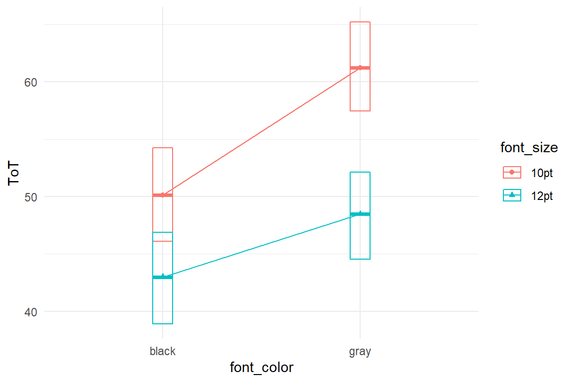
Figure 5.13: Conditional effects of font size and font color
Still, it gives the reader of a report some sense of the overall level of certainty. Usually, when two 95% CIs do not overlap, that means that the difference is almost certainly not zero. Another useful Ggplot geometry is the violin plot, as these make the overlap between posterior distributions visible and reduce visual clutter caused by vertical error bars.
However, a violin plot requires more that just three CLU estimates.
Recall from 4.1.1 that the posterior object, obtained with posterior stores the full certainty information gained by the MCMC estimation walk.
The CLU estimates we so commonly use, are just condensing this information into three numbers (CLU).
By pulling the estimated posterior distribution into the plot, we can produce a conditional plot that conveys more information and is easier on the eye.
P_amm <-
  posterior(M_amm) %>%
  filter(type == "fixef") %>%
  select(fixef, value) %>%
  separate(fixef, c("font_size", "font_color"), sep = ":") %>%
  mutate(
    font_size = str_replace(font_size, "font_size", ""),
    font_color = str_replace(font_color, "font_color", "")
  )


G_amm +
  geom_violin(
    data = P_amm,
    aes(
      y = value,
      fill = font_size
    ),
    alpha = 0.5,
    position = position_identity(),
    width = .2
  ) +
  labs(y = "ToT")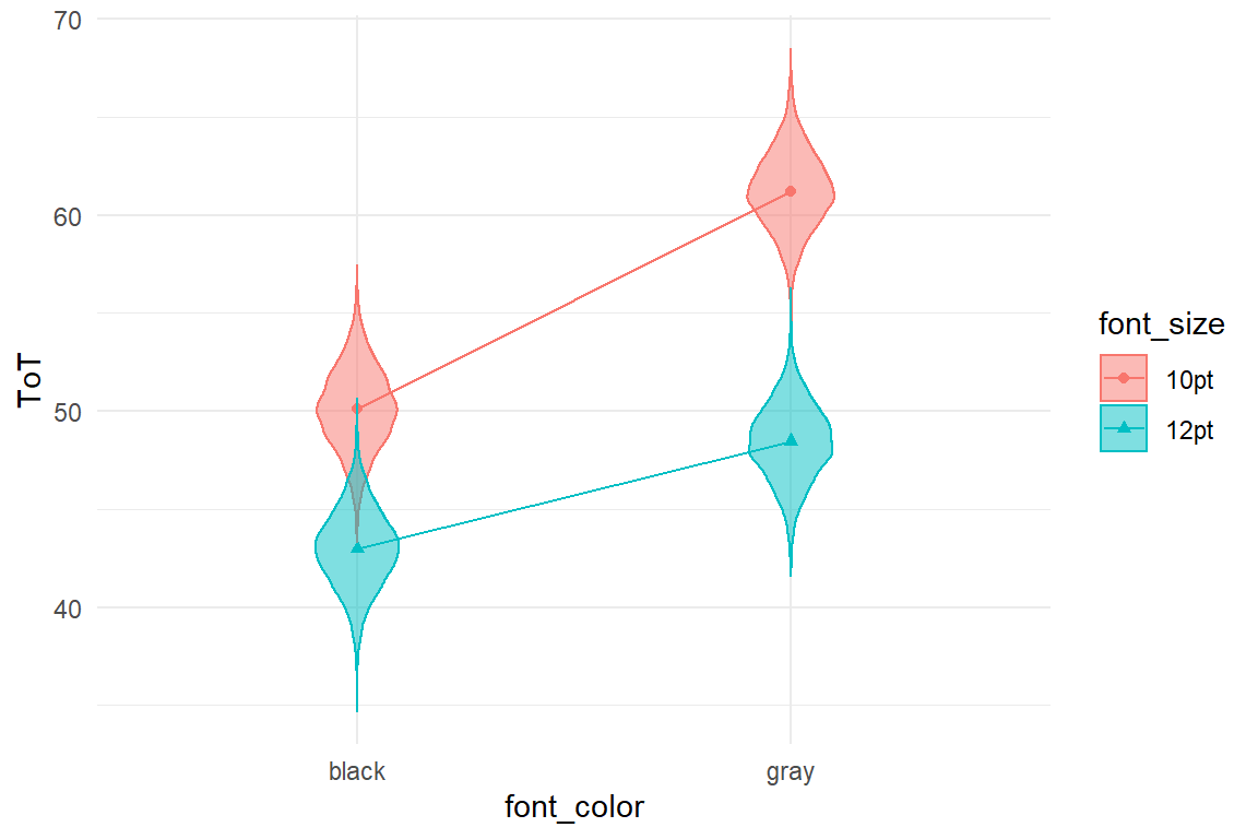
Figure 5.14: Another way to plot conditional effects from an AMM includes posterior distributions
Note how we just add one alternative layer to the original line plot object G_amm to get the violin plot. The violin layer here gets its own data set, which is another feature of the GGplot engine.
As Figures 5.13 and 5.14 show, ergonomics is maximized by using large fonts and high contrast. Still, there is saturation and therefore it does little harm to go with the gray font, as long as it is 12pt.
Saturation is likely to occur when multiple factors influence the same cognitive or physical system or functioning. In quantitative comparative design studies, we gain a more detailed picture on the co-impact of design interventions and can come to more sophisticated decisions.
If we don’t account for saturation by introducing conditional terms, we are prone to underestimate the net effect of any of these measures and may falsely conclude that a certain treatment is rather ineffective. Consider a large scale study, that assesses the simultaneous impact of many demographic and psychological variables on how willing customers are to take certain energy saving actions in their homes. It is very likely that impact factors are associated, like higher income and size of houses. Certain action require little effort (such as switching off lights in unoccupied rooms), whereas others are time-consuming (drying the laundry outside). At the same time, customers may vary in the overall eagerness (motivation). For high effort actions the impact of motivation level probably makes more of a difference than when effort is low. Not including the conditional effect would result in the false conclusion that suggesting high effort actions is rather ineffective.
5.4.4 Amplification: more than the sum
Saturation effects occur, when multiple impact factors act on the same system and work in the same direction. When reaching the boundaries, the change per unit diminishes. We can also think of such factors as exchangeable. Amplification conditional effects are the opposite: Something only really works, if all conditions are fulfilled. Conceiving good examples for amplification effects is far more challenging as compared to saturation effects. Probably this is because saturation is a rather trivial phenomenon, whereas amplification involves complex orchestration of cognitive or physiological subprocesses. Here, a fictional case on technology acceptance will serve to illustrate amplification effects. Imagine a start-up company that seeks funding for a novel augmented reality game, where groups of gamers compete for territory. For a fund raiser, they need to know their market potential, i.e. which fraction of the population is potentially interested. The entrepreneurs have two hypotheses they want to verify:
- Only technophile persons will dare to play the game, because it requires some top-notch equipment.
- The game is strongly cooperative and therefore more attractive for people with a strong social motif.
Imagine a study, where a larger sample of participants is asked to rate their own technophilia and sociophilia. Subsequently, participants are given a description of the planned game and were asked how much they intended to participate in the game.
While the example primarily serves to introduce amplification effects, it is also an opportunity to get familiar with conditional effects between metric predictors. Although this is not very different to conditional effects on groups, there are a few peculiarities, one being that we cannot straight-forwardly make an exploratory plot. For factors, we have used box plots, but these do not apply for metric predictors. In fact, it is very difficult to come up with a good graphical representation. One might think of 3D wire-frame plots, but these transfer poorly to the 2D medium of these pages.
Another option is to create a scatter-plot with the predictors on the axes and encode the outcome variable by shades or size of dots . These options may suffice to see any present main effects, but are too coarse to discover subtle non-linearity. The closest we can get to a good illustration is to artificially create groups and continue as if we had factor variables. Note, that turning metric predictors into factors is just a hack to create exploratory graphs, it is not recommended practice for linear models.
attach(AR_game)library(forcats) # fct_rev
D_1 %>%
mutate(
Sociophile =
fct_rev(if_else(sociophile > median(sociophile),
"high", "low"
)),
Technophile =
fct_rev(if_else(technophile > median(technophile),
"high", "low"
))
) %>%
ggplot(aes(y = intention, x = Technophile, col = Sociophile)) +
geom_boxplot() +
ylim(0, 0.5)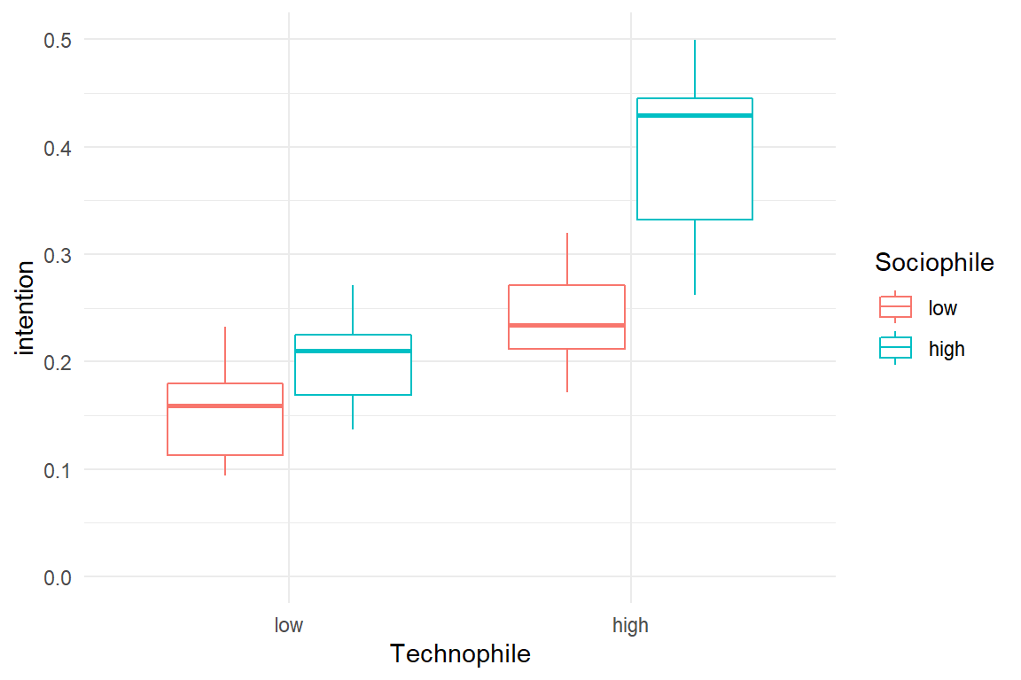
Figure 5.15: Visualizing continuous conditional effects as factors
From Figure 5.15 it seems that both predictors have a positive effect on intention to play. However, it remains unclear whether there is a conditional effect. In absence of a better visualization, we have to rely fully on the numerical estimates of a conditional linear regression model (CMRM)
M_cmrm <-
  stan_glm(intention ~ 1 + sociophile + technophile +
    sociophile:technophile,
  data = D_1
)coef(M_cmrm)| parameter | fixef | center | lower | upper |
|---|---|---|---|---|
| Intercept | Intercept | 0.273 | 0.258 | 0.288 |
| sociophile | sociophile | 0.114 | 0.076 | 0.153 |
| technophile | technophile | 0.183 | 0.153 | 0.214 |
| sociophile:technophile | sociophile:technophile | 0.164 | 0.081 | 0.244 |
Table 5.14 tells the following:
- Intention to buy is \(0.27 [0.26, 0.29]_{CI95}\) for people with minimum (i.e. zero) technophily and sociophily.
- One unit change on sociophily, which is the whole range of the measure, adds \(0.11 [0.08, 0.15]_{CI95}\) to intention (with sociophily constant zero).
- One unit change on technophily adds \(0.11 [0.08, 0.15]_{CI95}\) to intention (with sociophily constant zero).
- If both predictors change one unit, \(0.18 [0.15, 0.21]_{CI95}\) is added on top
confirms that sociophily and technophily both have a positive effect on intention. Both effects are clearly in the positive range. Yet, when both increase, the outcome increases over-linearly. The sociophile-technophile personality is the primary target group.
–> –> –>
–>
Saturation effects are about declining net effects, the more similar treatments pile up. Amplification effects are more like two-component glue. When using only one of the components, all one gets is a smear. You have to put them together for a strong hold.
Saturation and amplification also have parallels in formal logic (Table 5.15).
The logical AND, requires both operands to be TRUE for the result to become TRUE.
Instead, a saturation process can be imagined as logical OR.
If A is already TRUE, B no longer matters.
tibble(
  A = c(F, F, T, T),
  B = c(F, T, F, T)
) %>%
  as_tibble() %>%
  mutate("A OR B" = A | B) %>%
mutate("A AND B" = A & B) | A | B | A OR B | A AND B |
|---|---|---|---|
| FALSE | FALSE | FALSE | FALSE |
| FALSE | TRUE | TRUE | FALSE |
| TRUE | FALSE | TRUE | FALSE |
| TRUE | TRUE | TRUE | TRUE |
For decision making in design research, the notion of saturation and amplification are equally important. Saturation effects can happen with seemingly different design choices that act on the same cognitive (or other) processes. That is good to know, because it allows the designer to compensate one design feature with the other, should there be a conflict between different requirements, such as aesthetics and readability of text. Amplification effects are interesting, because they break barriers. Only if the right ingredients are present, a system is adopted by users. Many technology break-throughs can perhaps be attributed to adding the final necessary ingredient.
Sometimes we can see that on technology that first is a failure, just to take off years later. For example, the first commercial smart phone (with touchscreen, data connectivity and apps) has been the IBM Simon Personal Communicator, introduced in 1993. Only a few thousands were made and it was discontinued after only six months on the market. It lasted more than ten years before smartphones actually took off. What were the magic ingredients added? My best guess is it was the combination of good battery time and still fitting in your pockets.
A feature that must be present for the users to be satisfied (in the mere sense of absence-of-annoyance) is commonly called a necessary user requirements. That paints a more moderate picture of amplification in everyday design work: The peak, where all features work together usually is not the magic break-through; it is the strenuous path of user experience design, where user requirements whirl around you and not a single one must be left behind.
5.4.5 Conditional effects and design theory
Explaining or predicting complex behaviour with psychological theory is a typical approach in design research. Unfortunately, it is not an easy one. While design is definitely multifactorial, with a variety of cognitive processes, individual differences and behavioural strategies, few psychological theories cover more than three associations between external or individual conditions and behaviour. The design researcher is often forced to enter a rather narrow perspective or knit a patchwork model from multiple theories. Such a model can either be loose, making few assumptions on how the impact factors interact which others. A more tightened model frames multiple impact factors into a conditional network, where the impact of one factor can depend on the overall configuration. A classic study will now serve to show how conditional effects can clarify theoretical considerations.
Vigilance is the ability to remain attentive for rarely occurring events. Think of truck drivers on lonely night rides, where most of the time they spend keeping the truck on a straight 80km/h course. Only every now and then is the driver required to react to an event, like when braking lights flare up ahead. Vigilance tasks are among the hardest thing to ask from a human operator. Yet, they are safety relevant in a number of domains.
Keeping up vigilance most people perceive as tiring, and vigilance deteriorates with tiredness. Several studies have shown that reaction time at simple tasks increases when people are deprived of sleep. The disturbing effect of loud noise has been documented as well. A study by (Corcoran 1962) examined the simultaneous influence of sleep deprivation and noise on a rather simple reaction task. They asked:
will the effects of noise summate with those of loss of sleep to induce an even greater performance decrement or will noise subtract from the performance decrement caused by loss of sleep?
The theoretical argument is that sleep deprivation deteriorates the central nervous arousal system. In consequence, sleep deprived persons cannot maintain the necessary level of energy that goes with the task. Noise is a source of irritation and therefore usually reduces performance. At the same time, loud noise has an agitating effect, which may compensate for the loss of arousal due to sleep deprivation.
The Sleep case study is a simplified simulation of Corcoran’s results. Participants were divided into 2x2 groups (quiet/noisy, rested/deprived) and had to react to five signal lamps in a succession of trials. In the original study, performance measure gaps were counted, which is the number of delayed reactions (\(>1500ms\)). Here we just go with (simulated) reaction times, assuming that declining vigilance manifests itself in overall slower reactions (Figure 5.16).
attach(Sleep)D_1 %>%
ggplot(aes(
x = Environment,
color = Sleep,
y = RT
)) +
geom_boxplot()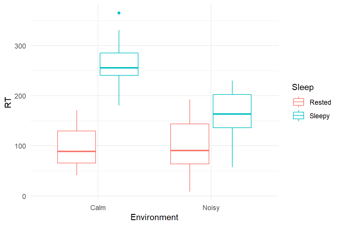
Figure 5.16: Conditional effects of environmental noise and sleep deprivation
Using a 2x2 model including a conditional effect, we examine the conditional association between noise and sleepiness. Note that the * operator in the model formula is an abbreviation for a fully factorial model 1 + Environment + Sleep + Environment:Sleep. The results are shown in Table 5.16
M_1 <-
  D_1 %>%
stan_glm(RT ~ Environment * Sleep, data = .)coef(M_1)| parameter | fixef | center | lower | upper |
|---|---|---|---|---|
| Intercept | Intercept | 97.68 | 63.1 | 130.7 |
| EnvironmentNoisy | EnvironmentNoisy | 2.32 | -47.7 | 53.9 |
| SleepSleepy | SleepSleepy | 163.58 | 114.2 | 212.4 |
| EnvironmentNoisy:SleepSleepy | EnvironmentNoisy:SleepSleepy | -103.50 | -173.4 | -32.9 |
Recall, that treatment contrasts were used, where all effects are given relative to the reference group quiet-rested (intercept). The results confirm the deteriorating effect of sleepiness, although its exact impact is blurred by pronounced uncertainty \(163.58 [114.21, 212.36]_{CI95}\). Somewhat surprisingly, noise did not affect well-rested persons by much \(2.32 [-47.67, 53.91]_{CI95}\). Note however, that we cannot conclude a null effect, as the credibility limits are wide. Maybe the lack of a clear effect is because steady white noise was used, not a disturbing tumult. The effect of sleepiness on RT is partly reduced in a noisy environment \(-103.5 [-173.38, -32.88]_{CI95}\). This suggests that the arousal system is involved in the deteriorating effect of sleep deprivation, which has interesting consequences for the design of vigilance tasks in the real world.
These findings reverb with a well known law in Psychology of Human Factors, the Yerkes-Dodson law, which states that human performance at cognitive tasks is influenced by arousal. The influence is not linear, but better approximated with a curve as shown in the Figure 5.17. Performance is highest at a moderate level of arousal. If we assume that sleepy participants in Corcona’s study showed low performance due to under-arousal, the noise perhaps has increased the arousal level, resulting in better performance. If we accept that noise has an arousing effect, the null effect of noise on rested participants stands in opposition to the Yerkes-Dodson law: if rested participants were on an optimal arousal level, additional arousal would usually have a negative effect on performance. There is the slight possibility, that Corcona has hit a sweet spot: if we assume that calm/rested participants were still below an optimal arousal level, noise could have pushed them right to the opposite point.
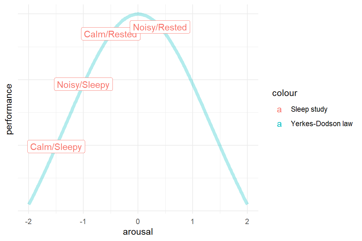
Figure 5.17: Conditional effects explained by the Yerkes-Dodson law
To sum it up, saturation and amplification effects have in common that performance is related to design features in a monotonous increasing manner, albeit not linearly. Such effects can be interpreted in a straight-forward manner: when saturation occurs with multiple factors, it can be inferred that they all impact the same underlying cognitive mechanism and are therefore interchangeable to some extent, like compensating letter size with stronger contrast.
In contrast, amplification effects indicate that multiple cognitive mechanisms (or attitudes) are necessarily involved. Whereas saturation effects point us at options for compensation, amplification narrows it down to a particular configuration that works.
The Sleep study demonstrated that conditional effects can also occur in situations with non monotonously increasing relationships between design features and performance. When such a relationship takes the form of a parabole, like the Yerkes-Dodson law, the designer (or researcher) is faced with the complex problem of finding the sweet spot.
In the next section we will see how paraboles, but also more wildly curved relationships can be modeled using linear models with polynomial. And we will see how sweet spots or, to be more accurate, a catastrophic spot can be identified.
5.5 Doing the rollercoaster: polynomial regression models
In the preceding sections, we used linear models with conditional effects to render processes that are not linear, but somehow curved. These non-linear processes fell into two classes: learning curves, saturation effects and amplification. But, what can we do when a process follows more complex curves, with more ups-and downs? In the following I will introduce polynomial regression models, which still uses a linear combination, but can describe a wild variety of shapes for the association between two variables.
Robots build our cars and sometimes drive them. They mow the lawn and may soon also deliver parcels to far-off regions. In prophecies robots will also enter social domains, such as care for children and the elderly. One can imagine that in social settings emotional acceptance plays a significant role for technology adoption. Next to our voices, our faces and mimic expressions are the main source of interpersonal messaging. Since the dawn of the very idea of robots, anthropomorphic designs have been dominant. Researchers and designers all around the globe are currently pushing the limits of human-likeness of robots. (Whereas I avoid Science Fiction movies with humonoid extraterrestrians.) One could assume that emotional response improves with every small step towards perfection. Unfortunately, this is not the case. (Mori 1970) discovered a bizarre non-linearity in human response: people’s emotional response is proportional to human-likeness, but only at the lower end. A robot design with cartoon style facial features will always beat a robot vacuum cleaner. But, an almost anatomically correct robot face may provoke a very negative emotional response, an intense feeling of eery, which is called the Uncanny Valley (Figure 5.18).
tibble(
  hl = seq(-1, 1, length.out = 100),
  emotional_valence = -.5 * hl + .6 * hl^3 + .2 * hl^4
) %>%
  mutate(human_likeness = (hl + 1) / 2) %>%
  ggplot(aes(x = human_likeness, y = emotional_valence)) +
  geom_line()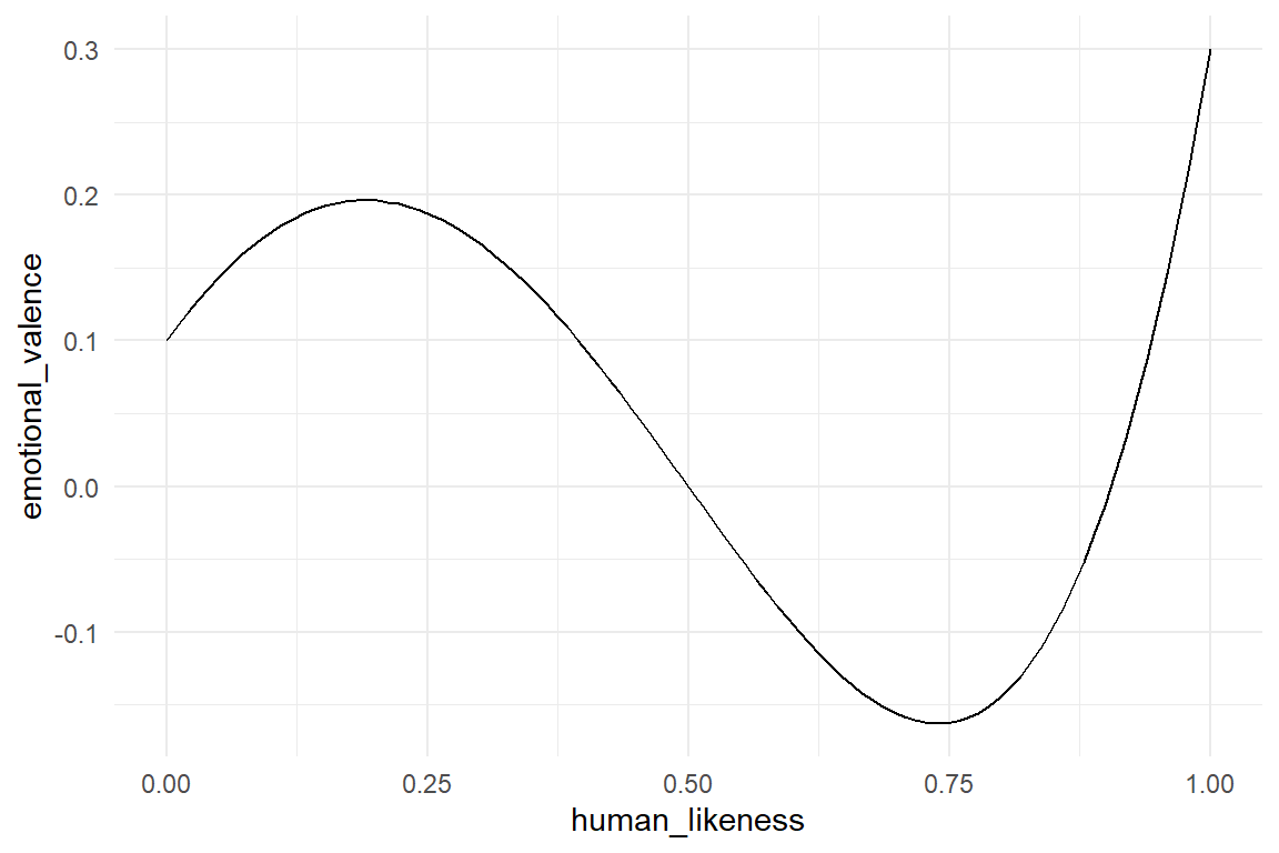
Figure 5.18: The Uncanny Valley phenomenon is a non-linear emotional response to robot faces
In (Mathur and Reichling 2016), the observation of Mori is put to a test: Is the relationship between human-likeness and emotional response really shaped like a valley? They collected 60 pictures of robots and attached a score for human likeness to them. Then they frankly asked their participants how much they liked the faces. For the data analysis they calculated an average score of likeability per robot picture. Owing to the curved shape of the uncanny valley, linear regression is not applicable to the problem. Instead, Mathur et al. applied a third degree polynomial term.
A polynomial function of degree \(k\) has the form:
\[ y_i = \beta_0 x_i^0 + \beta_1 x_i^1 + ... + \beta_{k} x_i^{k} \]
The degree of a polynomial is its largest exponent. In fact, you are already familiar with two polynomial models. The zero degree polynomial is the grand mean model, with \(x_i^0 = 1\), which makes \(\beta_0\) a constant. A first degree polynomial is simply the linear model: \(\beta_0 + \beta_1x_{1i}\) By adding higher degrees we can introduce more complex curvature to the association (Figure 5.19).
D_poly <-
  tibble(
    x = seq(-2, 3, by = .1),
    degree_0 = 2,
    degree_1 = 1 * degree_0 + 3 * x,
    degree_2 = 0.5 * (degree_1 + 2 * x^2),
    degree_3 = 0.5 * (degree_2 + -1 * x^3),
    degree_4 = 0.4 * (degree_3 + 0.5 * x^4),
    degree_5 = 0.3 * (degree_4 + -0.3 * x^5)
  ) %>%
  gather(polynomial, y, degree_0:degree_5) %>%
  arrange(polynomial, y, x)

D_poly %>%
  ggplot(aes(x, y)) +
  geom_line() +
  facet_wrap(~polynomial)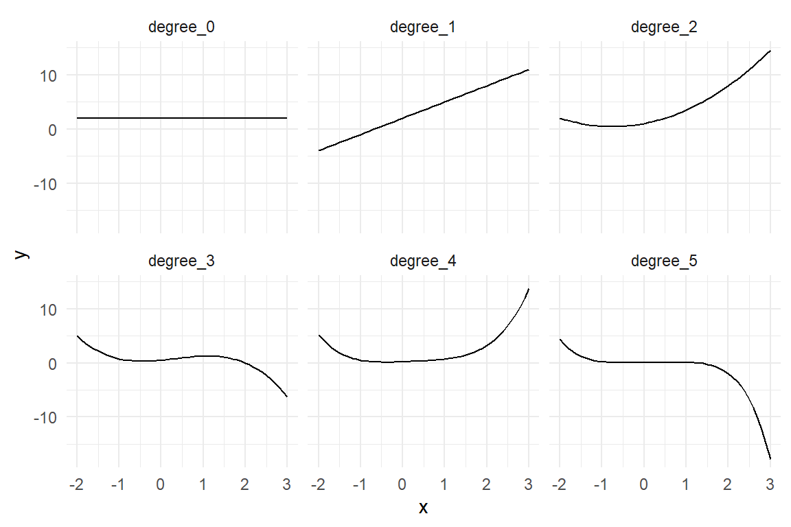
Figure 5.19: The higher the degree of a polynomial, the more complex the association.
Mathur et al. argue that the Uncanny Valley curve possesses two stationary points, with a slope of zero: the valley is a local minimum and represents the deepest point in the valley, the other is a local maximum and marks the shoulder left of the valley. Such a curvature can be approximated with a polynomial of (at least) third degree, which has a constant term \(\beta_0\), a linear slope \(x\beta_1\), quadratic component \(x^2\beta_2\) and a cubic component \(x^3\beta_3\).
While R provides high-level methods to deal with polynomial regression, it is instructive to build the regression manually. The first step is to add variables to the data frame, which are the predictors taken to powers (\(x_k = x^k\)). These variables are then added to the model term, as if they were independent predictors. For better clarity, we rename the intercept to be \(x_0\), before summarizing the fixed effects. We extract the coefficients as usual. The four coefficients in Table 5.17 specify the polynomial to approximate the average likability responses.
attach(Uncanny)M_poly_3 <-
RK_2 %>%
mutate(
huMech_0 = 1,
huMech_1 = huMech,
huMech_2 = huMech^2,
huMech_3 = huMech^3
) %>%
stan_glm(avg_like ~ 1 + huMech_1 + huMech_2 + huMech_3,
data = ., iter = 2500
)
P_poly_3 <- posterior(M_poly_3)T_coef <- coef(P_poly_3)
T_coef| parameter | fixef | center | lower | upper |
|---|---|---|---|---|
| Intercept | Intercept | -0.449 | -0.516 | -0.378 |
| huMech_1 | huMech_1 | 0.149 | -0.322 | 0.588 |
| huMech_2 | huMech_2 | -1.092 | -2.006 | -0.086 |
| huMech_3 | huMech_3 | 0.919 | 0.282 | 1.499 |
The thing is, coefficients of a polynomial model rarely have a useful interpretation. Mathur and Reichling also presented a method to extract meaningful parameters from their model. If staying out of the Uncanny Valley is the only choice, it it is very important to know, where precisely it is. The trough of the Uncanny Valley is a local minimum of the curve and we can find this point with polynomial techniques.
Finding a local minimum is a two step procedure: first, we must find all stationary points, which includes all local minima and maxima. Stationary points occur, where the curve bends from a rising to falling or vice versa. At these points, the slope is zero, neither rising nor falling. Therefore, stationary points are identified by the derivative of the polynomial, which is a second degree (cubic) polynomial:
\[ f'(x) = \beta_1 + 2\beta_2x + 3\beta_2x^2 \]
The derivative \(f'(x)\) of a function \(f(x)\) gives the slope of \(f(x)\) at any given point \(x\). When \(f'(x) > 0\), \(f(x)\) is rising at \(x\), with \(f'(x) < 0\) it is falling. Stationary points are precisely those points, where \(f'(x) = 0\) and can be found by solving the equation. The derivative of a third degree polynomial is of the second degree, which has a quadratic part. This can produce a parabolic form, which hits point zero twice, once rising and once falling. A rising encounter of point zero indicates that \(f(x)\) has a local minimum at \(x\), a falling one indicates a local maximum. In consequence, solving \(f'(x) = 0\) can result in two solutions, one minimum and one maximum, which need to be distinguished further.
If the stationary point is a local minimum, as the trough, slope switches from negative to positive; \(f'(x)\) crosses \(x = 0\) in a rising manner, which is a positive slope of \(f'(x)\). Therefore, a stationary point is a local minimum, if \(f''(x) > 0\).
Mathur et al. followed these analytic steps to arrive at an estimate for the position of the trough. However, they used frequentist estimation methods, which is why they could not attach a level of uncertainty to their estimate. We will apply the polynomial operations on the posterior distribution which results in a new posterior for the position of the trough.
library(polynom)

poly <- polynomial(T_coef$center) # UC function on center
dpoly <- deriv(poly) # 1st derivative
ddpoly <- deriv(dpoly) # 2nd derivative
stat_pts <- solve(dpoly) # finding stat points
slopes <- as.function(ddpoly)(stat_pts) # slope at stat points
trough <- stat_pts[slopes > 0] # local minimum

cat("The trough is most likely at a huMech score of ", round(trough, 2))
## The trough is most likely at a huMech score of 0.72Note how the code uses high-level functions from package polynom to estimate the location of the trough, in particular the first and second derivative d[d]poly.
Every step of the MCMC walk produces a simultaneous draw of the four parameters huMech_[0:3], and therefore fully specifies a third degree polynomial.
If the position of the trough is computed for every step of the MCMC walk, the result is a posterior distribution of the trough position.
For the convenience, the R package Uncanny contains a function trough(coef) that includes all the above steps.
The following code creates a data frame with one row per MCMC draw and the four huMech variables, the function trough acts on this data frame as a matrix of coefficients and returns one trough point per row.
We have obtained the PD of the trough.
devtools::install_github("schmettow/uncanny")P_trough <-
P_poly_3 %>%
filter(type == "fixef") %>%
select(chain, iter, fixef, value) %>%
spread(fixef, value) %>%
select(Intercept, starts_with("huMech")) %>%
mutate(trough = uncanny::trough(.)) %>%
gather(key = parameter)This derived posterior distribution we can put it into a CLU form (Table 5.18) or plot it toegtehr with the estimated polynomial curve (Figure 5.20))
P_trough %>%
  group_by(parameter) %>%
  summarize(
    center = median(value, na.rm = T),
    lower = quantile(value, .025, na.rm = T),
    upper = quantile(value, .975, na.rm = T)
) | parameter | center | lower | upper |
|---|---|---|---|
| huMech_1 | 0.149 | -0.322 | 0.588 |
| huMech_2 | -1.092 | -2.006 | -0.086 |
| huMech_3 | 0.919 | 0.282 | 1.499 |
| Intercept | -0.449 | -0.516 | -0.378 |
| trough | 0.715 | 0.650 | 0.801 |
The 95% CI is a conventional measure of uncertainty and may be more or less irrelevant. The most generous display on uncertainty is a density plot on the full posterior. The density function just smooths over the frequency distribution of trough draws, but makes no arbitrary choices on where to cut it.
RK_2$M_poly_3 <- predict(M_poly_3)$center

gridExtra::grid.arrange(
  RK_2 %>%
    ggplot(aes(x = huMech, y = avg_like)) +
    geom_point(size = .3) +
    geom_smooth(aes(y = M_poly_3), se = F),
  P_trough %>%
    filter(parameter == "trough") %>%
    ggplot(aes(x = value)) +
    geom_density() +
    xlim(0, 1),
  heights = c(.7, .3)
)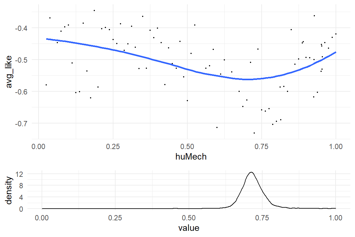
Figure 5.20: Estimated Uncanny Valley curve and position of trough
With reasonable certainty, we can say that the trough is at approximately two-thirds of the huMech score range. In contrast, the illustration of the uncanny valley as they used to be perpetuated from the original source, place the trough at about four quarters of the scale. The Uncanny Valley effect sets in “earlier” than I thought, at least.
A closer look at the scatterplot above reveals a problem with the data set: It seems that data is sparsest right where the valley is deepest.
Since there also is a lot of noise, the concern is that there actually is no trough.
This can be tested on the same posterior.
The uncanny::trough function returns a missing value, when no minimum stationary point could be found.
Hence, the proportion of non-NAs is the certainty we have that a trough exists:
cert_trough <- 1 - mean(is.na(P_trough))
cat("Certainty that trough exists:", cert_trough)
## Certainty that trough exists: 15.5.1 Make yourself a test statistic
Generally, in design research we are interested in real world impact and this book takes a strictly quantitative stance. Rather than testing the hypothesis whether any effect exists or not, we interpret coefficients by making statements on their magnitude and uncertainty.
We evaluated the position of the local minimum, the trough. The theory goes that the Uncanny Valley effect is a disruption of a slow upwards trend, the disruption creates the shoulder and culminates in the trough. But, there is no single coefficient telling us directly that there actually are a shoulder and a trough.
Polynomial theory tells us that a cubic function can have two stationary points, but it can also just have one or zero. After all, straight line is a cubic, too, if we set the quadratic and cubic coefficients to zero. But that would mean that teh UNcanny Valley effect does not exist. If we run our MCMC chains long enough, they will visit spots in parameter space, where \(\beta_2\) and \(\beta_3\) are close to zero, or: areas where the cubic coefficient dominates, and there is just is a saddle.
When a cubic model is estimated, the MCMC walk makes random visits in a four-dimensional coefficient space 4.1.1 (five-dimensional, if we count the error variance). These coordinates are stored per iteration in a posterior distribution object. Every iteration represents one possible polynomial, as is illustrated in Figure 5.21.
attach(Uncanny)post_pred(M_poly_3, thin = 100) %>%
left_join(RK_2, by = "Obs") %>%
ggplot(aes(x = huMech, y = value, group = iter)) +
stat_smooth(geom = "line", se = FALSE)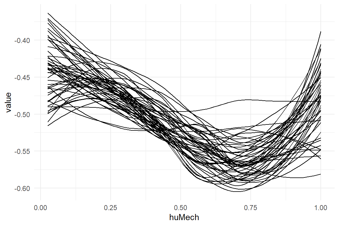
Figure 5.21: MCMC estimation produces one polynomial per sample (40 shown)
All we have to do is count the number of MCMC visits, that have a trough and a shoulder.
The function trough in the Uncanny package (on Github) is designed to return the position, when it exists and returns NA otherwise.
The same goes for the function shoulder, which finds the local maximum.
With these two functions, we can create a test statistics, by counting how many of the MCMC draws represent a cubic polynomial with shoulder and trough.
# devtools::install_github("schmettow/uncanny")
library(uncanny)

P_wide <-
  P_poly_3 %>%
  filter(type == "fixef") %>%
  # as_tibble() %>%
  select(iter, parameter, value) %>%
  spread(key = parameter, value = value) %>%
  select(Intercept, starts_with("huMech")) %>%
  mutate(
    trough = uncanny::trough(.),
    shoulder = uncanny::shoulder(.),
    is_Uncanny = !is.na(trough) & !is.na(shoulder)
  )

cert_Uncanny <- mean(P_wide$is_Uncanny)

cat("The Uncanny Valley exists with a certainty of: ", cert_Uncanny)
## The Uncanny Valley exists with a certainty of: 0.999So, with the our data we can be pretty sure that the Uncanny Valley effect is present. Probably, there is a very tiny chance that it does not exist, which we would only catch by increasing the resolution of the posterior, i.e. running more MCMC iterations. This conclusion is remarkable also from a philosophy-of-science perspective. It was in 1970, when Masahiro Mori published his theory on the relation between human likeness and emotional response. Fifty years later this article is all but outdated in how lucidly it anticipates the emerge of human-like robots and virtual characters (Mori 1970) . What can surprise the modern reader in Social Sciences is how the article abruptly stops, right where we would expect the experimental part confirming the theory.
It almost seems that Mori’s theory sprang just from his own feelings, and he just left it at that. Introspection as a scientific method is likely to give seasoned researcher another uncanny feeling. But that would be unjust! In the first place, Mori made on observation his own inner world and assumed that others would feel the same. Once the world was ready it, Mori’s theory turned out to provable and immensely useful for design.
Still, I argue that we have not yet fully confirmed Mori’s theory. Strictly spoken, the data of Mathur & Reichling only prove that on average the effect exists, because we aggregated scores over participants It would be much stronger to state: everyone experiences the Uncanny Valley. In essence, we could estimate the same cubic models, but one per participant. That requires non-aggregated data, because the analysis of very participant requires the data from every participant. The next chapter will introduce multi-level models, which can simultaneously estimate a model on population level and participant level. At the end of the following chapter, we will return to the Uncanny Valley with more data to feed our chains. Spoiler alert: the Uncanny Valley effect could be universal.
5.6 Further readings
- The original paper on the IPump case illustrates how Bayesian analysis can be reported in scientific journals (Schmettow, Schnittker, and Schraagen 2017).
- Our Uncanny Valley experiment is described in detail in (Koopman 2019).